Matt
The Hybrid Render Farm Guide: From Iron to Ether
Abandoning the “Closet Farm” for Data-Center Standards in a Hybrid World
The era of the “closet farm”—stacking commodity workstations in a loosely air-conditioned spare room—is effectively dead. The convergence of photorealistic path tracing, AI-driven generative workflows, and volumetric simulation has created a new reality: if you try to render 2026-era jobs on residential infrastructure, you will likely trip a breaker before you deliver a frame.
To succeed in this landscape, Technical Directors and Systems Architects must adopt a “Hybrid Model.” This approach, pioneered by studios like The Molecule VFX (now CraftyApes), treats local hardware (“Iron”) as the cost-effective base load and utilizes the cloud (“Ether”) strictly as an infinite safety valve.
Whether you are upgrading an existing room or building from scratch, here is your architectural blueprint for balancing local power with cloud agility.
Phase 1: The “Buy vs. Rent” Math
Before you purchase a single screw, you must determine your Utilization Threshold. While the cloud offers infinite scale, the economics still heavily favor local hardware for consistent work.
The 35% Rule
If you utilize your render nodes more than 35% of the time (approximately 8.4 hours/day), building your own farm is vastly cheaper than renting.
-
Local Node: Operating a high-density node costs approximately $1.06 per hour (factoring in hardware depreciation over 3 years, power at $0.20/kWh, and cooling).
-
Cloud Instance: Comparable instances typically cost between $2.50 and $6.00+ per hour for on-demand rates.
-
The Breakeven: A local node typically pays for itself after 3,000 to 4,000 hours of usage—roughly 4 to 6 months of continuous rendering.
The Strategy: Build enough local nodes to cover your “base load” (dailies, look-dev, average delivery schedules). Use the cloud only for the spikes that exceed this capacity.
Phase 2: The Hardware Architecture (The “Density” War)
In 2026, a standard render node is defined by its ability to dissipate 2000W–3000W of heat. This isn’t a PC; it’s a space heater that does math.
The GPU Dilemma: Speed vs. Physics
The release of the NVIDIA RTX 50-series (Blackwell) has reshaped the landscape, offering a choice between raw speed and engineering stability.
1. The Consumer Flagship (RTX 5090)
-
The Pros: This is the speed king, offering nearly double the bandwidth (1,792 GB/s) of previous generations.
-
The Cons: At 575W and a 4-slot width, it is physically impossible to fit four of them into a standard 4U chassis using stock coolers.
-
The Fix: To achieve density, you must strip the air coolers and install single-slot water blocks (e.g., Alphacool ES), reducing the card width to ~20mm. This requires a custom loop with an external radiator (like a MO-RA3) because the heat density is too high for internal radiators.
2. The Pro Standard (RTX 6000 Ada)
-
The Pros: For “set and forget” reliability, this remains the standard. Its dual-slot blower fan design exhausts heat directly out of the chassis rear.
-
The VRAM Advantage: 48GB of ECC VRAM is critical for production scenes that exceed the 32GB limit of consumer cards. If you run out of VRAM, your render speeds can drop by 90% as the system swaps to system RAM.
The CPU Commander
While GPUs render the pixels, the CPU handles scene translation. The AMD Threadripper 7960X (24 Core) is the sweet spot. Its high clock speeds accelerate the single-threaded “pre-render” phase (BVH building), freeing up your expensive GPUs faster than lower-clocked, high-core-count EPYC chips.
⚠️ Safety Critical: Power Delivery
Powering a 2,800W node requires rigorous adherence to modern standards.
-
The Connector: You must use the ATX 3.1 (12V-2×6) standard. Its recessed sense pins ensure the GPU will not draw power unless the cable is fully seated, preventing the “melting connector” failures of the RTX 4090 era.
-
The Dual PSU Trap: You will likely need two power supplies (e.g., 2x 1600W) to drive this load.
-
CRITICAL WARNING: Both PSUs must share a Common Ground. This means plugging them into the same PDU or circuit. Plugging them into different wall outlets on different phases can create ground loops that will destroy your PCIe bus and GPUs.
-
Phase 3: Infrastructure Engineering (The Hidden Costs)
Building a modern farm is an exercise in facilities engineering. Do not underestimate the environmental impact of high-density compute.
Cooling: The BTU Equation
A single rack of just 5 nodes generates over 51,000 BTU/hr.
-
The Reality: This requires approximately 4.25 tons of dedicated cooling capacity.
-
The Gear: Standard consumer A/C units are insufficient; they cannot handle the 100% duty cycle. You need Computer Room Air Conditioning (CRAC) units designed to manage both temperature and humidity to prevent static or condensation.
Networking: Why 10GbE is Dead
With modern NVMe drives reading at 3,500 MB/s, a standard 10GbE network (capped at ~1,100 MB/s) creates a severe bottleneck. Your expensive GPUs will sit idle waiting for textures to load.
-
The New Standard: 25GbE (SFP28). It matches the throughput of PCIe x4 NVMe drives.
-
Budget Tip: Look at MikroTik switches (CRS series). They offer high-throughput SFP28 ports without the massive enterprise markup of Cisco or Arista.
Phase 4: Storage Architecture (Preventing Starvation)
If your storage cannot feed your GPUs, your farm is wasting money. The industry standard is TrueNAS SCALE (ZFS), but it must be tuned correctly.
The “Secret Weapon”: Metadata VDEV
-
The Problem: “Directory walking” (scanning thousands of texture files to find the right one) kills hard drive performance. It makes high-speed drives feel sluggish.
-
The Solution: Store all file system Metadata on a mirrored pair of high-endurance NVMe SSDs (Special VDEV). This makes file lookups instantaneous, regardless of how slow the spinning disks are.
Tiering Strategy
-
Capacity: Use Enterprise HDDs (Seagate Exos or WD Gold) in RAID-Z2 for the bulk of your data.
-
Cache: Use an L2ARC (NVMe) to cache “hot” assets currently being rendered. This keeps the active project in fast silicon while the rest sits on cheap iron.
Phase 5: The “Brain” (Software in a Post-Deadline World)
With the industry-standard AWS Thinkbox Deadline 10 entering “maintenance mode” in late 2025, studios face a fork in the road.
-
For the “Hybrid” Studio: AWS Deadline Cloud
-
This managed service requires no server maintenance and offers seamless scaling. It’s the easiest path but comes with perpetual operational costs (OpEx) and a “usage-based” billing model.
-
-
For the DIY/Free: Afanasy (CGRU)
-
A hidden gem. It is lightweight, supports complex dependency chains, and allows wake-on-LAN. Ideally suited for smaller studios that want to avoid licensing fees entirely.
-
-
For the Enterprise: OpenCue
-
Robust, scalable, and free (open source). However, it requires significant DevOps knowledge (Docker, PostgreSQL) to deploy and maintain.
-
OS Note: Linux (Rocky 9 / Ubuntu) is the superior choice for render nodes, offering 10–15% faster rendering times and significantly better VRAM management than Windows.
Phase 6: The “Ether” (Cloud Bursting Strategy)
The Molecule VFX proved that the cloud is most powerful when it’s invisible. During a project for Tyler, The Creator, they bypassed physical limitations by building a “Studio in the Cloud.”
How to Burst Correctly
-
Spot Instances: Never pay on-demand prices. Use Spot Instances (AWS) or Preemptible VMs to secure compute at up to 90% off standard rates. Your render manager must handle the “interruptions” automatically.
-
Zero Data Transfer: The hardest part of bursting is syncing data. Use tools like AWS File Cache or high-performance filers (Weka, Qumulo) to present a unified namespace. This allows cloud nodes to transparently “see” local files without you having to manually copy terabytes of data before a render starts.
-
Kubernetes Auto-scaling: Automate the “spin up.” The system should detect queue depth and launch cloud pods instantly. Crucially, it must spin them down “the moment the queue empties” to ensure you never pay for idle time.
How to Install Docker ubuntu on a DigitalOcean Droplet
Installing Docker on a DigitalOcean Droplet running Ubuntu is a standard procedure.1 While DigitalOcean offers a “One-Click” Docker image in their marketplace, knowing how to install it manually ensures you have control over the version and configuration.
Here is the step-by-step guide to installing Docker Engine (Community Edition).
Want $200 DigitalOcean Credit? Claim It Here
Step 1: Update and Install Prerequisites
First, connect to your droplet via SSH.2 Before installing, ensure your existing package list is up-to-date and install a few packages that allow apt to use packages over HTTPS.3
Bash
sudo apt update
sudo apt install apt-transport-https ca-certificates curl software-properties-common
Step 2: Add Docker’s Official GPG Key
You need to add the GPG key to ensure the software you’re downloading is authentic.4
Bash
curl -fsSL https://download.docker.com/linux/ubuntu/gpg | sudo gpg --dearmor -o /usr/share/keyrings/docker-archive-keyring.gpg
Step 3: Add the Docker Repository
Add the Docker repository to your APT sources.5 This command dynamically inserts the correct repository for your specific version of Ubuntu.
Bash
echo "deb [arch=$(dpkg --print-architecture) signed-by=/usr/share/keyrings/docker-archive-keyring.gpg] https://download.docker.com/linux/ubuntu $(lsb_release -cs) stable" | sudo tee /etc/apt/sources.list.d/docker.list > /dev/null
Step 4: Install Docker Engine
Now that the repository is added, update your package index again and install Docker.6
Bash
sudo apt update
sudo apt install docker-ce docker-ce-cli containerd.io
Step 5: Execute Docker Without Sudo (Optional but Recommended)
By default, the docker command must be run with sudo (root privileges).7 To run docker commands as your current non-root user (e.g., sammy or a standard user), add your user to the docker group:8
Bash
sudo usermod -aG docker $USER
Note: You must log out of the droplet and log back in for this group membership to take effect.
Step 6: Verify Installation
Once you have logged back in, verify that Docker is running and installed correctly:
-
Check Status:
Bash
sudo systemctl status dockerYou should see a green “active (running)” status.
-
Run a Test Container:
Bash
docker run hello-worldIf successful, Docker will download a test image and print “Hello from Docker!” along with some explanatory text.
Alternative: DigitalOcean 1-Click App
If you are creating a new droplet rather than using an existing one, you can skip the steps above by selecting the Docker image from the “Marketplace” tab during the Droplet creation process. This comes with Docker and Docker Compose pre-installed.
Summary Table
| Command | Purpose |
sudo systemctl status docker |
Checks if the Docker daemon is active. |
docker ps |
Lists currently running containers. |
docker images |
Lists container images stored locally. |
docker pull [image] |
Downloads an image from Docker Hub. |
Stop Using list.index(): The Safe Way to Find Strings in Python Lists
If you Google “how to find a string in a list python,” the top result will almost always tell you to use the built-in index() method.
For a quick script or a coding interview, that works fine. But if you put raw index() calls into a production application, you are planting a time bomb in your code.
Why? Because the moment your data doesn’t match your expectations, index() doesn’t just return -1 or None. It crashes your entire script.
This guide covers why the standard method fails and shows you the three “Production-Ready” patterns to find list items safely.
The Trap: Why list.index() is Dangerous
In a perfect world, the data we search for always exists. In the real world, APIs fail, user input is typo-prone, and lists are empty.
Here is the standard way most tutorials teach list searching:
Python
# A list of server status codes
status_logs = ['200_OK', '404_NOT_FOUND', '500_SERVER_ERROR']

# The "Standard" Way
position = status_logs.index('301_REDIRECT')

# CRASH: ValueError: '301_REDIRECT' is not in list
If that line of code runs inside a web request or a data pipeline, the whole process halts. To fix this, we need to handle “missing” data gracefully.
Method 1: The “Ask Forgiveness” Pattern (EAFP)
Best for: Readable, enterprise-standard code.
Python follows a philosophy called EAFP: “Easier to Ask Forgiveness than Permission.” Instead of checking if the item exists first, we try to find it and handle the specific error if we fail.
This is the most robust way to use the standard index() method:
Python
status_logs = ['200_OK', '404_NOT_FOUND', '500_SERVER_ERROR']
target = '301_REDIRECT'

try:
    position = status_logs.index(target)
except ValueError:
    position = None  # Or -1, depending on your logic

if position is not None:
    print(f"Found at index {position}")
else:
    print("Item not found (Application is safe!)")
Why this wins: It explicitly tells other developers reading your code, “I know this item might be missing, and here is exactly what I want to happen when it is.”
Method 2: The “Senior Dev” One-Liner
Best for: Clean code, utility functions, and avoiding nested indentation.
If you dislike the visual clutter of try/except blocks, you can use a Python generator with the next() function. This is a pattern you will often see in high-performance libraries.
Python
status_logs = ['200_OK', '404_NOT_FOUND', '500_SERVER_ERROR']
target = '301_REDIRECT'

# Finds the index OR returns None - in a single line
position = next((i for i, item in enumerate(status_logs) if item == target), None)

print(position)
# Output: None (No crash!)
How this works:
-
enumerate(status_logs): Creates pairs of(0, '200_OK'),(1, '404_NOT_FOUND')… -
if item == target: Filters the stream to only look for matches. -
next(..., None): This is the magic. It grabs the first matching index. If the generator is empty (no match found), it returns the default value (None) instead of crashing.
Performance Note: This is highly efficient. Because it is a generator, it “lazy evaluates.” If the item is at index 0, it stops searching immediately. It does not scan the rest of the list.
Method 3: Handling Duplicates (Getting All Positions)
The standard index() method has a major limitation: it only returns the first match.
If you are parsing a log file where an error appears multiple times, index() is useless. You need a List Comprehension.
Python
server_events = ['200_OK', '500_ERROR', '200_OK', '500_ERROR']
target = '500_ERROR'

# Get a list of ALL indexes where the error occurred
error_indexes = [i for i, x in enumerate(server_events) if x == target]

print(error_indexes)
# Output: [1, 3]
The “Real World” Check (Case Insensitivity)
In production, users rarely type perfectly. If you search for “admin” but the list contains “Admin”, index() will fail.
The Senior Dev One-Liner (Method 2) shines here because it allows you to normalize data on the fly without rewriting the original list.
Python
users = ['Admin', 'Editor', 'Guest']
search_term = 'admin' # Lowercase input

# Convert both to lowercase strictly for the comparison
pos = next((i for i, x in enumerate(users) if x.lower() == search_term), None)

print(pos)
# Output: 0 (Correctly found 'Admin')
Read Next: Python Security Risks Every Developer Should Know
Docker Compose Ports
Here is a comprehensive reference page for the ports configuration in Docker Compose.
Overview
The ports configuration in docker-compose.yml maps ports from the Container to the Host machine. This allows external traffic (from your browser, other computers, or the host itself) to access services running inside your containers.
1. The Short Syntax
This is the most common method. It uses a string format to define the mapping.
Note: Always use quotes (e.g.,
"80:80") when using the short syntax. If you omit them, YAML may interpret ports like22:22as a base-60 number, causing errors.
Format: [HOST:]CONTAINER[/PROTOCOL]
| Format | Description | Example |
| “HOST:CONTAINER” | Maps a specific host port to a container port. | - "8080:80" (Host 8080 $\to$ Container 80) |
| “CONTAINER” | Maps the container port to a random ephemeral port on the host. | - "3000" |
| “IP:HOST:CONTAINER” | Binds the port to a specific network interface (IP) on the host. | - "127.0.0.1:8001:8001" |
| Range | Maps a range of ports. | - "3000-3005:3000-3005" |
Example: Short Syntax
services:
  web:
    image: nginx
    ports:
      - "8080:80"           # Map host 8080 to container 80
      - "127.0.0.1:3000:80" # Map localhost 3000 to container 80 (Restricted to host only)
      - "443:443"           # Map HTTPS
2. The Long Syntax
The long syntax allows for more configuration options and is generally more readable. It is available in Compose file formats v3.2 and later.
Attributes:
-
target: The port inside the container.
-
published: The port exposed on the host.
-
protocol:
tcporudp(defaults to tcp). -
mode:
host(publish on every node) oringress(load balanced).
Example: Long Syntax
services:
  database:
    image: postgres
    ports:
      - target: 5432
        published: 5433
        protocol: tcp
        mode: host
3. Protocol Specification (TCP/UDP)
By default, Docker assumes TCP. To expose UDP ports (common for DNS, streaming, or gaming servers), you must specify it.
Short Syntax:
ports:
  - "53:53/udp"
  - "53:53/tcp"
Long Syntax:
ports:
  - target: 53
    published: 53
    protocol: udp
4. ports vs. expose
Users often confuse these two configuration keys.
| Feature | ports | expose |
| Accessibility | Accessible from the Host machine and external network (internet). | Accessible ONLY to other services within the same Docker network. |
| Use Case | Web servers, APIs, Databases you need to access from your laptop. | Databases or Redis caches that only your backend app needs to talk to. |
| Example | - "80:80" |
- "6379" |
Common Pitfalls & Best Practices
-
Security Risk (0.0.0.0): By default,
- "3000:3000"binds to0.0.0.0, meaning anyone with your IP address can access that port. If you are developing locally, always bind to localhost to prevent outside access:YAMLports: - "127.0.0.1:3000:3000" -
Port Conflicts: If you try to run two containers mapping to the same Host port (e.g., both trying to use port 80), Docker will fail to start the second one. You must change the Host side of the mapping (e.g.,
"8081:80").
CSS Makes Your Images Look Good. A VPS Makes Them Load Fast.
You want a beautiful, responsive site where every image is perfectly framed, regardless of the user’s screen size. In our previous guide to CSS object-fit, we mastered the art of making images visually fit into any container without distortion.
If you followed that guide, your site probably looks fantastic.
But there is a hidden trap with modern CSS image techniques. If you aren’t careful, you might be creating a beautiful, slow-loading disaster that tanks your SEO and frustrates mobile users.
Here is why CSS is only half the battle, and why serious websites need the infrastructure to back up their design.
The “Invisible” Problem with CSS Resizing
CSS properties like object-fit and width: 100% handle the display dimensions of an image. They do absolutely nothing to the file size.
Imagine you upload a stunning, high-resolution photograph straight from Unsplash. It’s 4000 pixels wide and weighs in at 5MB. You place it in a small “Recent Posts” card on your homepage that is only 300 pixels wide.
You use CSS:
.thumbnail {
   width: 300px;
   height: 200px;
   object-fit: cover;
}
Visually, it looks perfect. The browser shrinks it down neatly.
But here is the reality: Every visitor to your homepage—even someone on a shaky 4G mobile connection—has to download that entire 5MB file, just to view a tiny 300px thumbnail.
This kills your Core Web Vitals scores, increases bounce rates, and wastes your users’ data.
The Solution: Dynamic, Server-Side Optimization
To have a site that looks great and loads instantly, you need to serve images that are expertly sized for the exact slot they are filling.
You shouldn’t serve that 4000px image. You should serve a 300px version that has been compressed and converted to a modern format like WebP or AVIF.
You could manually Photoshop every image into five different sizes before uploading, but that’s unmanageable. The professional solution is On-the-Fly Image Optimization.
This means when a user requests an image, your server instantly grabs the original, resizes it perfectly for that specific request, optimizes it, caches it, and delivers the tiny new file.
Why Shared Hosting Can’t Handle the Load
Real-time image manipulation—using heavy-duty libraries like ImageMagick, GD, or Node.js ‘Sharp’—is incredibly CPU-intensive.
If you try to run a dynamic image server on standard cheap shared hosting, one of two things will happen:
-
Your host will throttle your CPU usage, making your images load agonizingly slowly.
-
Your host will flag your account for abusing server resources and shut you down.
Shared hosting is built for serving static text files, not for intense computational tasks like crunching thousands of pixels instantly.
The VPS Advantage
This is the inflection point where a serious project needs to graduate to a Virtual Private Server (VPS).
A VPS gives you dedicated slices of CPU and RAM that are yours alone. You aren’t fighting for resources with hundreds of other websites on the same machine.
With a modest VPS, you gain the power to:
-
Run powerful optimization engines: Install Node.js, Python, or advanced PHP modules to handle image resizing in milliseconds.
-
Automate Next-Gen Formats: Automatically convert JPEGs to highly efficient WebP or AVIF formats on the fly.
-
Improve Core Web Vitals: Serve the exact file size needed, drastically lowering your Largest Contentful Paint (LCP) times.
Take Control of Your Infrastructure
Don’t let heavy files undermine your beautiful CSS work. By moving to a VPS, you gain the control and power necessary to ensure your images are as lightweight as they are good-looking.
It’s the difference between a site that looks professional and a site that performs professionally.
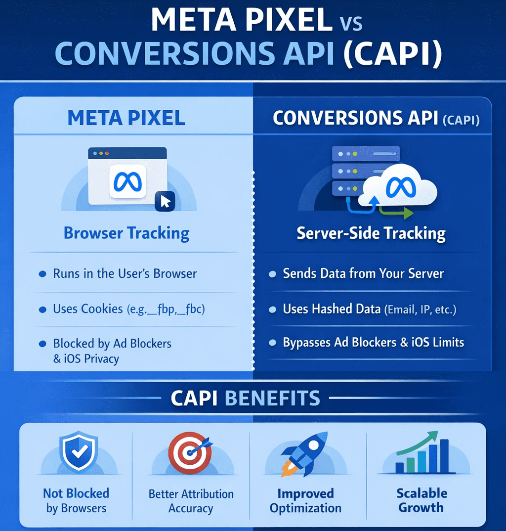
Meta Pixel vs Conversions API (CAPI)
For years, most advertisers relied on the Meta Pixel to understand what happened after someone clicked an ad. You installed a small snippet of code on your site, and Meta could see page views, leads, and purchases inside the browser. It worked — until the internet changed.
Privacy updates from Apple, browser-level tracking prevention, and widespread ad blockers have significantly reduced how much data browser-based tracking can reliably collect. As a result, many advertisers now see gaps in reporting, delayed attribution, or missing conversions — even when campaigns are clearly driving results.
This is where Meta’s Conversions API (CAPI) comes in.
Instead of relying solely on the user’s browser, CAPI allows conversion events to be sent directly from your server to Meta. This server-side approach makes tracking more resilient to privacy restrictions, improves data accuracy, and gives Meta’s delivery system more consistent signals to optimize campaigns.
That doesn’t mean the Meta Pixel is obsolete — far from it. Pixel and CAPI are designed to work together, each serving a different role in modern ad measurement.
What is the Meta Pixel?
The Meta Pixel is a browser-based JavaScript tracker that fires events when a user loads a page or takes an action.
How it works
-
Runs in the user’s browser
-
Uses cookies (
_fbp,_fbc) -
Sends events like
PageView,ViewContent,AddToCart,Purchase
Strengths
-
Very easy to install
-
Real-time feedback in Events Manager
-
Captures on-site behavior like scroll depth, clicks, watch time
Limitations (big ones)
-
Blocked by:
-
Ad blockers
-
iOS privacy rules (ITP)
-
Browser tracking prevention
-
-
Loses attribution when cookies expire or are stripped
-
Increasingly under-reports conversions
Best use
Front-end signal discovery (what users do on the page)
What is Conversions API (CAPI)?
CAPI is server-side tracking. Instead of relying on the browser, your server sends events directly to Meta.
If you run a CRM, Shopify, or any big branded platforms chances are CAPI is already part of the system, you would just need to make sure it’s enabled and set up properly.
If you run a more basic website like a WordPress site, or something that doesn’t have built in support, then you would need to either build your own backend server (you can literally do this very easily in DigitalOcean), run it locally (not recommended), or pay to use a service which does all of it for you with a guarantee of ad attribution performance and ad savings. If you’re interested in that last bit, and if you spend a hefty sum per month on Meta ads, you might want to consider looking deeper into this.
How it works
-
Events are sent from:
-
Your backend
-
A tag manager server
-
A custom endpoint
-
-
Can include hashed identifiers:
-
Email
-
Phone
-
IP
-
User agent
-
fbp/fbc (when available)
-
Strengths
-
Not blocked by browsers or ad blockers
-
More stable attribution
-
Better match quality for Meta’s AI
-
Required for advanced attribution and scaling
Limitations
-
More complex to implement
-
Needs proper event deduplication
-
Requires backend or server tooling
Best use
Reliable conversion truth for optimization and reporting
Pixel vs CAPI (quick comparison)
| Area | Meta Pixel | CAPI |
|---|---|---|
| Runs in | Browser | Server |
| Blockable | Yes | No |
| iOS impact | High | Minimal |
| Setup | Easy | Technical |
| Attribution accuracy | Medium → Low | High |
| Required for scale | ❌ | ✅ |
The correct setup (this is the key part)
You should NOT choose Pixel or CAPI.
You should run BOTH.
Why?
-
Pixel captures behavioral signals (what users do)
-
CAPI guarantees conversion delivery
-
Meta deduplicates events using
event_id
Correct flow
-
Pixel fires event in browser
-
Server sends the same event via CAPI
-
Meta deduplicates
-
AI gets cleaner, richer data
-
Delivery and optimization improve
This is exactly how Meta expects serious advertisers to operate in 2026.
When Pixel alone is “good enough”
-
Small spend (<$50/day)
-
Lead gen without backend control
-
Early testing / MVP funnels
Even here, you’re flying partially blind.
When CAPI becomes mandatory
-
Scaling spend
-
iOS-heavy audiences
-
Ecommerce
-
Video + engagement optimization
-
Advanced attribution (multi-touch, offline, CRM)
If you’re doing any serious optimization, Pixel-only is no longer sufficient.
How Meta’s AI actually uses this data
Meta’s delivery system doesn’t just look at conversions — it looks at:
-
Event frequency
-
Signal consistency
-
Identity match quality
-
Engagement depth (watch time, dwell, repeats)
CAPI improves confidence, not just counts.
That’s why campaigns often stabilize after CAPI is implemented — even when reported numbers don’t jump dramatically.
Bottom line
-
Meta Pixel = visibility + behavioral signals
-
CAPI = reliability + optimization fuel
-
Together = modern, scalable tracking
Want it just done for you?
Book a demo with Hyros where they handle everything
Running NordVPN in Docker on DigitalOcean (for Region-Lock Testing)
This guide shows how coders can run NordVPN inside a Docker container on a DigitalOcean Droplet and then route test containers through it to verify geo-based restrictions, region-locked APIs, pricing, or content behavior. If you need help installing NordVPN in a Docker container, you might find this guide on Windows helpful + this guide for MacOS helpful.
⚠️ Important: A VPN inside Docker does not VPN the host.
Only traffic generated by containers using the VPN container’s network is routed through NordVPN. This is intentional and exactly what we want for controlled testing.
Why this setup exists (quick context)
This approach is ideal when you need:
-
Real data-center IPs in specific countries
-
A repeatable, disposable geo-testing environment
-
Isolation between “normal app traffic” and “geo-simulated traffic”
You are not trying to “secure the Droplet” — you’re trying to simulate geography.
Architecture (mental model)
Only containers explicitly attached to the VPN container’s network go through the tunnel.
Click Here To Save With DigitalOcean Discount
Requirements
-
DigitalOcean Droplet (Ubuntu 22.04 or newer) – how to create a droplet
-
Docker + Docker Compose installed
-
NordVPN account
-
NordVPN login token (required for non-GUI Docker usage) – watch this video it shows how to get service credentials
Step 1: Create the Droplet & install Docker
SSH into your Droplet, then install Docker:
Verify:
Step 2: Build the official NordVPN Docker image
This follows NordVPN’s documented approach, with no shortcuts.
Create a project directory
Create the Dockerfile
Paste:
Build the image:
Step 3: Run the NordVPN container (VPN only)
Why these flags matter
-
NET_ADMIN→ required to create VPN routes -
/dev/net/tun→ required for tunnel interfaces -
Hostname lock → prevents identity changes across restarts
Step 4: Authenticate using a NordVPN token
Inside the container:
Then connect to a country:
Confirm:
At this point, this container is fully VPN-connected.
Step 5: Turn the NordVPN container into a “VPN gateway”
Open a new terminal (outside the container).
Any container that uses:
will share the NordVPN container’s network stack — meaning all outbound traffic exits via the VPN.
Step 6: Run a geo-test container through the VPN
Example: test IP + country
Expected output:
If you see your Droplet’s region instead, the container is not attached to the VPN network.
Step 7: Run real code through the VPN
Node.js / Python / Playwright / curl / Postman
Any tool works the same way.
Example with a Node container:
Now:
-
API calls
-
OAuth redirects
-
Pricing endpoints
-
Content checks
…all behave as if they originate from the chosen country.
Switching regions (fast testing loop)
Inside the NordVPN container:
Then re-run your test containers.
This gives you a tight, repeatable geo-testing loop.
Common issues & fixes
/dev/net/tun missing
If missing:
Auth fails
-
Use token-based login
-
Do not use email/password inside Docker
IPv6 leaks or odd routing
If you suspect IPv6 issues, explicitly disable it at the container level:
(Some Nord docs mention this, but the value is commonly mis-documented.)
Click Here To Save With DigitalOcean Discount
Best Keyboard for Coding & Programming
If you write code for a living, your keyboard isn’t an accessory — it’s one of your most important tools.
Most developers will type millions of keystrokes per year, often in long, focused sessions. Yet many still use whatever keyboard came in the box or whatever was cheapest on Amazon. The result? Wrist pain, shoulder tension, fatigue, and in some cases real repetitive strain injuries.
The good news: the right keyboard can dramatically improve comfort, speed, accuracy, and even focus.
This guide breaks down exactly how to choose the best keyboard for coding based on real developer workflows — and the specific models that consistently perform well for programmers.
Whether you’re a web developer, software engineer, data engineer, or student learning to code, this will help you make a smart, future-proof choice.
Click for my favorite keyboard
Who This Guide Is For
This article is written for:
-
Software engineers & web developers
-
Indie hackers & SaaS builders
-
Data engineers & analysts
-
Students learning to code
-
Anyone spending multiple hours per day typing in an IDE or terminal
If you code regularly, this applies to you.
Why Your Keyboard Matters More for Coding Than You Think
Coding is not casual typing.
You’re constantly using:
-
Symbols (
{ } [ ] ( ) ; : < >) -
Modifier keys (Cmd, Ctrl, Alt, Shift)
-
Navigation (arrows, home/end, page up/down)
-
Shortcuts and key combos
Over time, small ergonomic issues compound. A bad layout, poor key feel, or awkward wrist angle can lead to:
-
Wrist and forearm pain
-
Shoulder and neck tension
-
Slower typing and more errors
-
Fatigue that affects focus and productivity
Most developers don’t notice until something starts hurting. By then, it’s already a problem.
A good keyboard won’t magically fix everything — but the right layout, switches, and ergonomics can make a massive difference over months and years.
How to Choose the Right Keyboard for Coding
Instead of jumping straight to product recommendations, let’s break down the 5 factors that actually matter for programmers.
This is the framework you should use before buying anything.
1. Layout: Full, TKL, 75%, 60%, or Split?
Layout determines how much movement your hands and shoulders make all day. This matters more than most people realize.
Full-Size (100%)
Includes number pad. Good for:
-
Data-heavy work
-
Finance, spreadsheets, analytics
-
Some backend workflows
Downside: wider reach, more shoulder movement.
TKL (Tenkeyless) – 87 keys
No number pad. Very popular with developers.
Good balance of:
-
Compact size
-
Full navigation cluster
-
Minimal learning curve
75% Layout
Slightly more compact than TKL but keeps arrows + nav keys.
One of the best layouts for most programmers.
60% Layout
Very compact. No dedicated arrows or nav keys.
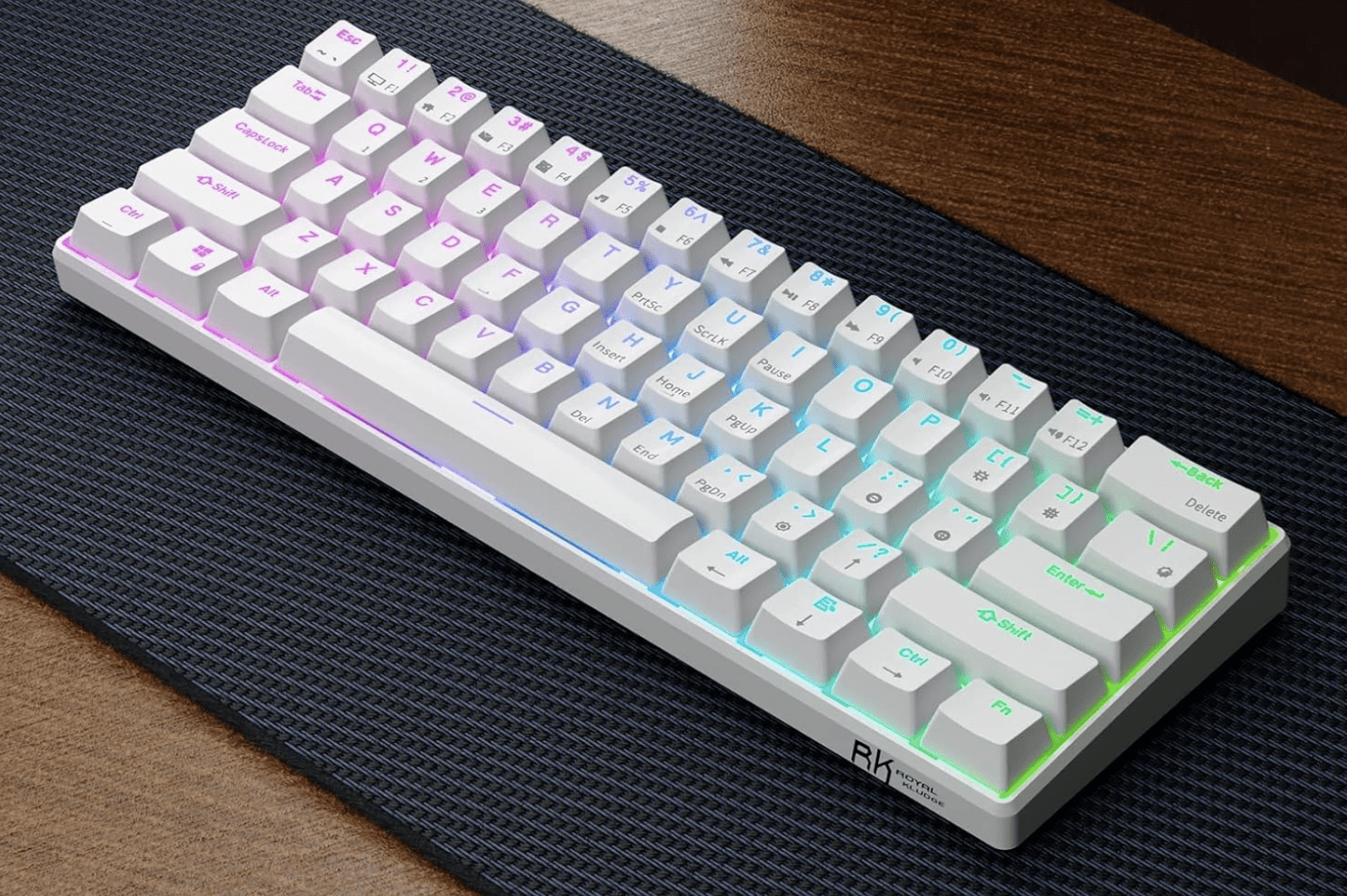
RK Royal Kludge RK61
Good for:
-
Minimalist setups
-
Vim users
-
Travel
Downside: heavy reliance on layers. Not ideal for everyone.
Split / Ergonomic Layouts
Two halves, often tented.
Good for:
-
Wrist pain
-
Shoulder issues
-
Long daily sessions
Downside: learning curve.
Rule of thumb:
If you use arrow keys, home/end, and page navigation a lot (most devs do), don’t go smaller than 75%.
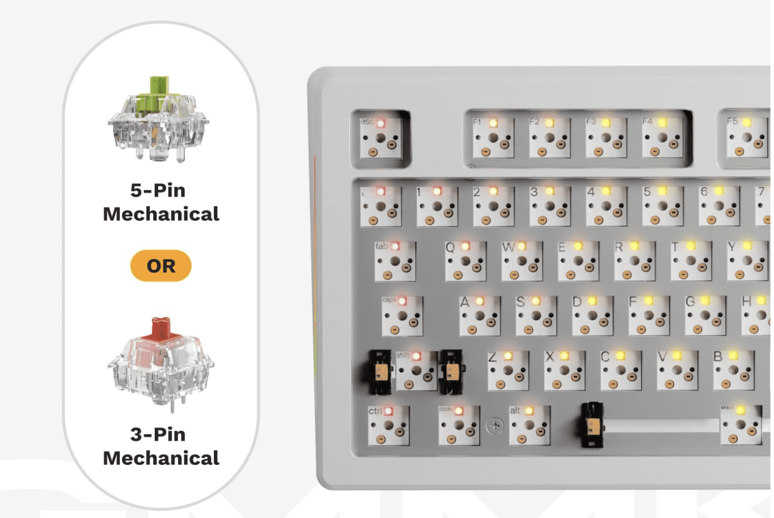
2. Switch Type: Linear vs Tactile vs Clicky (In Coder Terms)
This is about feel and feedback, not gaming performance.
Tactile (e.g. Brown-style)
-
Small bump when key actuates
-
Great feedback for accuracy
-
Popular among developers
Linear (e.g. Red-style)
-
Smooth, no bump
-
Fast and quiet
-
Good for speed and low fatigue
Clicky (e.g. Blue-style)
-
Loud, clicky feedback
-
Generally not recommended for shared spaces
-
Can be fatiguing over long sessions
Most programmers prefer tactile or linear switches.
Clicky switches are fun, but not ideal for 8-hour workdays.
3. Key Feel & Fatigue: Low Profile vs Standard
Low-profile keyboards (like laptop-style keys) have:
-
Shorter travel
-
Less finger movement
-
Lower learning curve
Standard mechanical boards have:
-
Deeper travel
-
More tactile feedback
-
Often better long-term comfort for heavy typists
There is no universal “best” here — it depends on:
-
Your typing style
-
Hand size
-
Desk height
-
Whether you came from laptops or desktops
4. Programmability & Layers (Underrated for Coders)
This is huge and often ignored.
Keyboards that support QMK, VIA, or custom remapping let you:
-
Move symbols to easier positions
-
Create layers for navigation
-
Add macros for repetitive actions
-
Optimize layouts for your IDE
If you use:
-
Vim / Neovim
-
Heavy keyboard shortcuts
-
Custom workflows
Then programmability is a major advantage.
5. Ergonomics & Wrist Health
If you code 4–10 hours a day, this matters.
Key ergonomic factors:
-
Wrist angle
-
Shoulder width
-
Forearm rotation
-
Key reach
Split keyboards and tented designs reduce:
-
Ulnar deviation (bending wrists sideways)
-
Shoulder tension
-
Forearm strain
If you’ve ever had:
-
Wrist pain
-
Numbness
-
Tingling
-
Elbow issues
You should strongly consider an ergonomic layout.
Best Keyboards for Coding by Category
Now that you know what matters, here are proven, well-regarded options for different developer profiles.
These are grouped by use case, not just price.
Best All-Around Keyboard for Coding
Keychron K Pro Series (K8 Pro, K2 Pro, K3 Pro)
Who it’s for:
Developers who want one solid keyboard that works across Mac, Windows, and Linux without fuss.
Why it’s great for coding:
-
Excellent 75% / TKL layouts
-
Hot-swappable switches
-
QMK/VIA support for remapping
-
Clean, professional look (no gamer nonsense)
Pros:
-
Great typing feel out of the box
-
Wireless + wired options
-
Strong community support
Cons:
-
Slightly tall (may need a wrist rest)
-
Not split/ergonomic
Bottom line:
If you want a safe, high-quality choice that “just works” for programming, this is it.
Best Keyboard for Long Coding Sessions
Logitech MX Keys S
Who it’s for:
Developers who value comfort, low fatigue, and a laptop-like feel.
Why it’s great for coding:
-
Low-profile keys reduce finger travel
-
Excellent stability and spacing
-
Great for multi-device workflows
-
Quiet (ideal for calls and shared spaces)
Pros:
-
Extremely comfortable for long sessions
-
Wireless, multi-device pairing
-
Clean professional design
Cons:
-
Not mechanical
-
Limited programmability
Bottom line:
If you code all day and want maximum comfort with minimal learning curve, this is hard to beat.
Best Compact Keyboard for Developers
Keychron K6 / K3 (65% / 75%)
Who it’s for:
Developers with limited desk space or who travel.
Why it’s great for coding:
-
Keeps arrow keys (unlike many 60% boards)
-
Compact footprint
-
Solid build quality
Pros:
-
Portable
-
Good layout for IDE work
-
Affordable
Cons:
-
Smaller keys = adjustment period
-
Less ergonomic than larger boards
Bottom line:
A great option if you want compact without sacrificing usability.
Best Ergonomic Keyboard for Programmers
Kinesis Advantage2 / Advantage360
or
Moonlander / Ergodox EZ
Who it’s for:
Developers with wrist, elbow, or shoulder pain — or those who want to prevent it.
Why it’s great for coding:
-
Split layout reduces wrist angle
-
Tented design improves posture
-
Fully programmable
-
Designed for heavy typists
Pros:
-
Excellent ergonomics
-
Highly customizable
-
Long-term comfort
Cons:
-
Steep learning curve
-
Expensive
-
Looks weird (you’ll get comments)
Bottom line:
If you code for a living and plan to do it for years, this is an investment in your health.
Best Budget Keyboard for Coding
Royal Kludge (RK) Series – RK68, RK84, RK61
Who it’s for:
Students, early-career devs, or anyone on a budget.
Why it’s great for coding:
-
Mechanical feel at low price
-
Decent layouts
-
Hot-swap on many models
Pros:
-
Affordable
-
Surprisingly solid
-
Good starter boards
Cons:
-
Software is mediocre
-
Build quality not premium
Bottom line:
If you want mechanical without spending a lot, these punch above their weight.
What Developers and Reddit Consistently Say Matters
Across developer and keyboard communities, the same themes come up over and over:
-
Comfort beats aesthetics
-
Layout matters more than brand
-
Tactile or linear switches are preferred for work
-
Programmability is underrated
-
Ergonomics becomes important sooner than you think
Many developers report that once they switched to a better keyboard, they:
-
Made fewer typing errors
-
Felt less fatigue
-
Had less wrist or shoulder pain
-
Enjoyed coding more
That’s not marketing hype — it’s a real productivity and health factor.
Common Mistakes Developers Make When Buying a Keyboard
Avoid these:
1. Going Too Small Too Fast
Jumping straight to 60% can be frustrating if you rely on arrows and nav keys.
2. Buying Gaming Keyboards for Work
RGB and “speed” features don’t equal comfort or productivity.
3. Ignoring Ergonomics
Pain creeps up slowly. By the time it’s bad, it’s harder to fix.
4. Not Considering Desk Setup
Keyboard choice should match:
-
Desk height
-
Chair height
-
Monitor position
-
Arm angle
Quick Decision Guide
If you want a fast answer:
-
I code 6–10 hours/day and want comfort → Logitech MX Keys, ergonomic split keyboard
-
I want one great mechanical board → Keychron K Pro series
-
I use Vim and love minimalism → 60–65% board with layers
-
I have wrist/shoulder pain → Split ergonomic keyboard
-
I’m on a budget → Royal Kludge series
FAQ
Are mechanical keyboards better for coding?
Not automatically. Many developers love them for feedback and feel, but low-profile boards like MX Keys are also excellent for long sessions.
Is a 60% keyboard good for programming?
It can be, especially for Vim users, but many developers find 75% or TKL layouts more practical.
What do most software engineers use?
There’s no single standard, but 75% / TKL mechanical keyboards and low-profile wireless boards are extremely common.
Are split keyboards worth it?
If you have pain or type for long hours daily, yes — many devs swear by them.
Final Thoughts
If you’re spending thousands of hours a year writing code, your keyboard is not the place to cheap out.
The right keyboard won’t just feel better — it can:
-
Reduce fatigue
-
Improve accuracy
-
Prevent long-term injury
-
Make coding more enjoyable
Take a little time to choose one that fits your workflow, your body, and your future.
Your hands will thank you.
Click for my favorite keyboard
Best VPNs for Coders & Developers
Advanced Features, Docker Support, CLI Automation, Mesh Networking & Real Dev Workflows
Most VPN reviews are written for people trying to watch Netflix in another country.
This guide is for people who run Docker, SSH into servers, build automation, scrape data, and actually care if their network stack breaks.
If you’re a developer, infra builder, automation engineer, or someone running a home lab, this is the VPN guide you’ve been looking for.
Click for my favorite vpn provider
Why Developers Actually Use VPNs (Not the Marketing Reasons)
Developers don’t use VPNs to “stay anonymous.” They use them because real-world dev workflows create real-world problems.
1. Secure Access to Servers & Infrastructure
If you’re SSH’ing into production, internal dashboards, or client systems from coffee shops, airports, or coworking spaces, a VPN adds a secure tunnel before you even hit your SSH keys and MFA.
It’s not about paranoia. It’s about reducing your attack surface.
2. Working on Hostile or Restricted Networks
Hotels, corporate Wi-Fi, conference networks, and international travel networks often:
-
block ports
-
inspect traffic
-
throttle connections
-
or straight up break SSH / Git
A VPN with obfuscation or WireGuard support often fixes this instantly.
3. Geo-Testing & Region Simulation
Developers frequently need to test:
-
regional pricing
-
localized content
-
country-specific APIs
-
ad delivery behavior
A VPN lets you see what users in Germany, Canada, or Singapore actually see — without spinning up servers in every region.
4. Scraping, Automation & Data Collection
If you’re running:
-
Playwright
-
Puppeteer
-
cron-based scrapers
-
API polling jobs
…you already know IP reputation matters. Routing automation traffic through a VPN (especially in Docker) is a clean way to:
-
avoid blocks
-
separate identities
-
and reduce risk
5. Home Lab & Internal Network Access
If you run:
-
a NAS (Synology, QNAP, etc.)
-
internal APIs
-
dev boxes
-
self-hosted services
A VPN or mesh network lets you access all of that remotely without opening ports to the internet.
This is a massive quality-of-life improvement.
What Makes a VPN “Developer-Grade”
Most “best VPN” lists talk about streaming and device counts. Developers care about completely different things.
1. Performance & Latency
Not just raw speed — but:
-
low ping
-
stable connections
-
long-lived sessions
This matters for:
-
SSH
-
streaming logs
-
WebSockets
-
remote debugging
WireGuard support is a big deal here.
2. Linux & Headless Support
If a VPN doesn’t:
-
support Linux cleanly
-
offer a CLI
-
work in headless environments
…it’s not a serious option for developers.
3. Split Tunneling (The Actually Useful Kind)
Developers use split tunneling to:
-
route Docker traffic through VPN
-
keep localhost, databases, and internal APIs off VPN
-
avoid breaking webhooks and tunnels
This is essential when you mix local dev + remote services.
4. Stability Over Flash
Random disconnects kill:
-
SSH sessions
-
CI jobs
-
long-running scripts
A “slower but stable” VPN is often better than a fast, flaky one.
5. Configurability & Control
Developers want:
-
protocol choice (WireGuard, OpenVPN)
-
port control
-
predictable routing
-
real kill switch behavior
Not “one button and pray.”
Advanced & Lesser-Known VPN Features Developers Actually Use
This is where most articles stop — and where real value starts.
1. Running VPNs Inside Docker Containers
This is huge for infra builders and automation devs.
Instead of running a VPN on your host machine, you can:
-
run the VPN client in its own container
-
route other containers through it
-
isolate traffic cleanly
-
avoid touching your host network stack
NordVPN in Docker
Nord officially supports this.
Common pattern:
-
one container runs NordVPN
-
other containers use
network_mode: service:nordvpn
Use cases:
-
Playwright scrapers
-
Puppeteer jobs
-
n8n workflows
-
API polling services
This is extremely clean for automation stacks.
ProtonVPN in Docker
Not as officially marketed, but widely used via:
-
WireGuard configs
-
OpenVPN configs
-
community images
Often used in:
-
CI runners
-
scraping pipelines
-
test harnesses
Private Internet Access (PIA) in Docker
Very popular with power users because:
-
highly configurable
-
supports port forwarding
-
easy to script
If you care about inbound connections or fine-grained control, PIA is strong here.
2. CLI Support for Automation & Headless Environments
This is non-negotiable for serious dev workflows.
With a CLI you can:
-
spin up a server
-
connect VPN
-
run a job
-
disconnect VPN
-
tear down server
All in a script.
VPNs with real CLI support:
-
NordVPN (Linux CLI)
-
ProtonVPN CLI
-
PIA CLI
-
Mullvad CLI
This is essential for:
-
cron jobs
-
CI pipelines
-
ephemeral servers
3. Mesh Networking (Nord Meshnet, Tailscale, ZeroTier)
This is one of the most underutilized features in the dev world.
Nord Meshnet
Nord quietly added Meshnet, which is essentially:
a private, device-to-device network built into NordVPN
What it lets you do:
-
access your home NAS remotely
-
connect dev machines together
-
hit internal APIs from anywhere
-
avoid port forwarding entirely
For home lab users, this is huge.
Tailscale
Tailscale is increasingly preferred by developers because:
-
it’s built on WireGuard
-
no exit nodes
-
no performance penalty
-
perfect for internal networks
If you want:
-
dev → NAS
-
dev → server
-
dev → internal tools
Tailscale is often better than a traditional VPN.
4. Port Forwarding
Most consumer VPNs hide or remove this. Developers actively need it.
Use cases:
-
webhook testing
-
inbound API callbacks
-
peer-to-peer services
VPNs that support it:
-
PIA
-
AirVPN
If you need inbound connectivity, this matters.
5. Dedicated IPs
Some APIs and enterprise systems:
-
block shared VPN IPs
-
require allowlisting
Dedicated IPs solve this.
Offered by:
-
NordVPN
-
PIA
-
CyberGhost
This is important for:
-
client systems
-
production dashboards
-
IP-restricted services
6. Obfuscation for Restricted Networks
If you work from:
-
corporate networks
-
hotels
-
international locations
Obfuscated servers help:
-
hide VPN usage
-
bypass restrictions
-
keep SSH and Git working
Supported by:
-
NordVPN
-
ProtonVPN
-
Surfshark
Feature Matrix – VPNs Compared for Developers
Here’s the at-a-glance view of what actually matters:
| Feature / VPN | NordVPN | ProtonVPN | PIA | Surfshark | ExpressVPN | Tailscale |
|---|---|---|---|---|---|---|
| Docker support | ✅ Official | ⚠️ Community | ✅ Popular | ⚠️ Limited | ❌ | ❌ |
| CLI support | ✅ | ✅ | ✅ | ❌ | ❌ | n/a |
| Mesh networking | ✅ Meshnet | ❌ | ❌ | ❌ | ❌ | ✅ |
| Port forwarding | ❌ | ❌ | ✅ | ❌ | ❌ | ❌ |
| Split tunneling | ✅ | ✅ | ✅ | ✅ | ❌ | n/a |
| WireGuard | ✅ | ✅ | ✅ | ✅ | ❌ | n/a |
| Dedicated IP | ✅ | ❌ | ✅ | ❌ | ❌ | ❌ |
| Linux support | ✅ | ✅ | ✅ | ⚠️ | ⚠️ | ✅ |
Click for my favorite vpn provider
Best VPNs for Coders – Deep Dives
NordVPN – Best All-Around for Infra & Automation Devs
Best for: Docker, mesh networking, general infra work
Why developers use it:
-
official Docker support
-
CLI on Linux
-
WireGuard (NordLynx)
-
Meshnet for internal access
Hidden strength:
-
Meshnet + Docker is a very powerful combo for home labs and automation stacks.
Limitation:
-
no port forwarding
ProtonVPN – Best for Privacy-Focused Developers
Best for: privacy, audits, open-source workflows
Why devs like it:
-
audited no-logs policy
-
open-source clients
-
excellent split tunneling
-
strong Linux support
Hidden strength:
-
great balance of privacy + usability
Limitation:
-
no port forwarding
-
Docker usage is less official
Private Internet Access (PIA) – Best for Power Users
Best for: configurability, inbound connections, scripting
Why devs use it:
-
port forwarding
-
CLI support
-
extremely configurable
-
works well in Docker
Hidden strength:
-
one of the few mainstream VPNs that still respects power users
Limitation:
-
UI is not pretty
-
less “polished” than Nord
Surfshark – Best Budget Option for Multi-Device Devs
Best for: freelancers with lots of devices
Why devs use it:
-
unlimited devices
-
decent WireGuard performance
Limitation:
-
weaker CLI and advanced features
-
not ideal for infra-heavy workflows
ExpressVPN – Best for Simplicity & Stability
Best for: people who want it to just work
Why devs use it:
-
extremely stable
-
good global coverage
Limitation:
-
weak Linux support
-
no Docker or CLI focus
-
not dev-oriented
Mesh VPNs & Self-Hosted Alternatives
Tailscale – Best for Internal Dev Networks
If you run:
-
NAS
-
dev servers
-
internal APIs
Tailscale is often better than a traditional VPN.
It gives you:
-
private IPs
-
zero config
-
no port forwarding
-
direct device-to-device access
This is perfect for home labs.
ZeroTier
Similar to Tailscale but more manual. Good for:
-
small teams
-
labs
-
experimental setups
WireGuard (Self-Hosted)
If you want:
-
full control
-
no third-party trust
-
your own VPN server
WireGuard on a VPS is excellent.
This is for people who are comfortable with:
-
networking
-
firewall rules
-
server management
Outline VPN
Simple self-hosted option. Good for:
-
small teams
-
internal access
-
minimal configuration
VPNs in Real Dev Workflows
VPN + Docker + Local Dev
Common patterns:
-
VPN container + service containers
-
split tunneling to avoid breaking localhost
-
routing scrapers through VPN only
This is extremely clean for automation.
VPN + SSH + Production Servers
Best practice:
-
VPN → bastion → prod
-
restrict prod to VPN IPs
-
no public SSH
Much safer.
VPN + CI/CD
Usually:
-
not needed for cloud pipelines
-
useful for:
-
on-prem runners
-
restricted APIs
-
internal systems
-
VPN + Scraping & Automation
Use VPNs to:
-
avoid IP bans
-
separate identities
-
protect your real IP
Combine with:
-
rate limiting
-
respectful crawling
-
legal compliance
VPN + Home Lab / NAS
This is one of the best uses.
Instead of:
-
opening ports
-
exposing services
You get:
-
private access
-
zero exposure
-
much better security
Mesh VPNs shine here.
Click for my favorite vpn provider
Common Problems & Fixes
“VPN broke my Docker networking”
Use:
-
split tunneling
-
network_mode: service:vpn -
or route only specific containers
“I can’t access localhost on VPN”
Exclude localhost from VPN or use split tunneling.
“npm install is slow on VPN”
Change DNS, switch protocol to WireGuard, or exclude npm traffic.
“SSH drops when VPN reconnects”
Use:
-
autossh
-
keepalive settings
-
more stable protocol
“Webhooks fail on VPN”
Likely blocked inbound traffic. Use:
-
port forwarding (PIA)
-
tunnel services
-
or exclude that service from VPN
VPN vs Corporate VPN vs Mesh VPN
| Use Case | Best Option |
|---|---|
| Freelance dev | Nord / Proton |
| Agency dev | Nord + Meshnet |
| Infra builder | Tailscale / WireGuard |
| Home lab | Tailscale / Nord Meshnet |
| Scraper dev | PIA / Nord Docker |
Key idea:
-
Traditional VPN = outbound privacy + security
-
Corporate VPN = company access
-
Mesh VPN = internal network access
They solve different problems.
Final Recommendations – Pick Based on Your Stack
If you’re:
-
Infra-heavy / automation dev:
→ NordVPN + Docker -
Privacy-focused dev:
→ ProtonVPN -
Power user with inbound needs:
→ PIA -
Home lab / NAS user:
→ Tailscale or Nord Meshnet -
Solo freelancer:
→ Surfshark
Click for my favorite vpn provider
Top VPS Hosting Providers in 2026 (And How to Choose the Right One)
If you’re ready to level up your hosting, Virtual Private Servers (VPS) offer a perfect middle ground between affordable shared hosting and expensive dedicated servers. Whether you’re building an app, running an online store, or launching a digital agency, a VPS gives you more speed, flexibility, and control.
But with so many VPS providers, how do you choose the right one?
This post breaks down what to look for, how VPS compares to other hosting options, and which providers offer the best value in 2026.
What Is VPS Hosting (and Why It Matters)
VPS hosting gives you your own slice of a physical server. Unlike shared hosting, where multiple users compete for the same resources, VPS environments are isolated — giving you better performance and security. You’ll get root access, more RAM, and the freedom to install custom software or run complex websites.
Key advantages:
- Greater speed and uptime
- Ability to scale as your site grows
- Full control over server settings
You can also choose between managed VPS (where the hosting company handles updates and maintenance) or unmanaged VPS (you’re on your own — but with more flexibility and lower cost).
What to Look For in a VPS Host
Not all VPS providers are created equal. Here are the features that matter most:
- SSD or NVMe storage: Faster load times and performance
- Scalability: Upgrade resources easily without downtime
- Support: 24/7 live chat or ticket support is a must
- Data centers: Choose a provider close to your target audience
- Control panels: Do you prefer cPanel, Plesk, or SPanel?
- Pricing: Look for fair monthly rates — and beware of high renewal costs
- Backups: Automatic snapshots are a bonus
- Security: Firewalls, DDoS protection, and SSLs should be standard
Click Here For My Favorite VPS Provider
The Best VPS Hosting Providers in 2026
Here’s a closer look at the top VPS options this year, based on price, performance, and who they’re best suited for.
🚀 DigitalOcean — Best for Developers
- From ~$4/month – low entry cost with predictable pricing
- Instant server deployment – launch a VPS in under a minute
- Hourly billing – pay only for what you use
- Easy vertical scaling – upgrade resources as you grow
- Developer-friendly dashboard – simple, clean, no bloat
- Strong API & CLI – built for automation and workflows
- Multiple server types – match compute to your workload
- Global data centers – low latency worldwide
- SSD-backed performance – fast disk and networking
- Built-in ecosystem – databases, storage, Kubernetes, load balancers
- Minimal learning curve – no AWS-style complexity
- Ideal for apps & startups – fast to build, easy to scale
- Click For My Favorite VPS Provider
🔧 Linode (Akamai) — Best for Transparency
- From $5/month
- Predictable pricing, excellent documentation, wide distro support
- Great for technical users
🧪 Vultr — Best OS Flexibility & Automation
- From $5/month
- Latest Linux distros, powerful API, solid security
- Perfect for budget-conscious devs needing variety
🌐 Kamatera — Best Custom Configurations
- From ~$4/month
- Global data centers, custom specs, 30-day free trial
- Ideal for international teams and Windows VPS
💰 Hostinger — Best Budget VPS
- From $5.99/month (4GB RAM)
- AI help, NVMe SSD, robust DDoS protection
- Great for small businesses or beginners
⚡ Hosting (previously A2) — Best for Speed
- From $7.99/month (unmanaged), $39.99 (managed)
- Turbo servers, anytime refund, free cPanel
- Great if speed is a priority
📦 InMotion Hosting — Best for Small Businesses
- From $14.99/month (managed)
- NVMe storage, 24/7 U.S. support, generous resources
- Ideal for growing companies
💡 Namecheap — Best Value VPS for Existing Users
- From $6.88/month
- Reliable SSD performance, easy-to-manage server
- Perfect for budget-conscious site owners
🛡️ OVHcloud — Best for EU Users & Security
- From ~$5/month
- DDoS protection, custom ISO, great EU coverage
- Strong choice for technical European users
🔐 ScalaHosting — Best for Business-Grade Security
- From $29.95/month (managed VPS)
- Daily backups, SPanel, premium support
- Great for mission-critical sites
Click Here For Our Favorite VPS Provider
Summary Table
| Provider | Starting Price | Best For |
|---|---|---|
| DigitalOcean | $4/mo | Developers and scalable projects |
| Linode (Akamai) | $5/mo | Technical users, transparent pricing |
| Vultr | $5/mo | OS variety, automation flexibility |
| Kamatera | ~$4/mo | Custom specs and global reach |
| Hostinger | $5.99/mo | Beginners, high RAM on a budget |
| A2 Hosting | $7.99/mo | Speed-focused websites |
| InMotion Hosting | $14.99/mo | Managed VPS for small businesses |
| Namecheap | $6.88/mo | Budget users with basic needs |
| OVHcloud | ~$5/mo | Advanced users in Europe |
| ScalaHosting | $29.95/mo | Business-grade security and support |
Choosing the Right VPS: What Really Matters
Here’s how to simplify your choice:
- Are you a developer? Go with DigitalOcean, Linode, Vultr, or Kamatera
- Need a managed solution? Try InMotion, A2 Hosting, or ScalaHosting
- On a budget? Hostinger and Namecheap deliver great value
- Running a serious business site? Prioritize support and backups with InMotion or ScalaHosting
Click Here For Our Favorite VPS Provider
Final Thoughts
VPS hosting is the next step for anyone serious about growing their website or app. It gives you the freedom to scale, secure your site, and optimize for performance. Whether you’re launching a new project or upgrading from shared hosting, there’s a provider on this list that fits your goals.
Looking to move beyond shared hosting? The right VPS setup can unlock speed, security, and flexibility for your online business. Start exploring your options today and take full control of your website’s performance.