Matt
How to Install Claude Code on Mac, Windows, and Linux
Installing Claude Code takes just a few minutes regardless of your operating system. Anthropic now offers native installers as the recommended method, and the entire process goes from download to first coding session in about five minutes. This guide covers every installation method for every platform so you can get Claude Code running quickly.
If you are new to the tool and want to understand what it does before installing, start with our overview of what Claude Code is and what it can do.
Claude Code runs on macOS 10.15 or later, most Linux distributions including Ubuntu 20.04 and Debian 10, and Windows 10 or later. You need at least 4GB of RAM and an active internet connection. The native installer does not require Node.js, which simplifies setup considerably compared to older npm-based methods.
You also need either a Claude Pro or Max subscription, or an Anthropic Console account with API credits. Claude Code authenticates through your browser on first launch, so make sure you have an active account ready. Not sure which plan to pick? See our Claude Code pricing breakdown.
Installing Claude Code on Mac
Open Terminal on your Mac. You can find it in Applications, then Utilities, or press Command+Space and type Terminal. Run the native install script from Anthropic’s official source. The installer downloads the correct binary for your Mac architecture, whether Intel or Apple Silicon, and configures your PATH automatically.
After the script finishes, verify the installation by typing “claude –version” in your terminal. You should see a version number without errors. The native macOS binary is signed by Anthropic PBC and notarized by Apple, so you should not see Gatekeeper warnings. If your Mac blocks it, go to System Preferences, then Security and Privacy, and allow the installer.
Mac users who prefer Homebrew can install with the brew install command instead. The important difference is that Homebrew installations do not auto-update. You need to manually run “brew upgrade claude-code” periodically. For most Mac users, the native installer is the better choice because of its automatic background updates.
Installing Claude Code on Windows
Windows users have two solid options: native installation or WSL.
For native installation, use WinGet from PowerShell or Command Prompt by running “winget install Anthropic.ClaudeCode” and following the prompts. After installation, verify with “claude –version” in Git Bash, PowerShell, or Command Prompt. Native Windows requires Git Bash for the full Claude Code experience. If you do not have it, install Git for Windows from the official Git website, which includes Git Bash. Windows Terminal is recommended as your terminal emulator. Note that WinGet installations do not auto-update, so run “winget upgrade Anthropic.ClaudeCode” periodically.
For WSL installation, open PowerShell as Administrator and run “wsl –install -d Ubuntu” to set up WSL with Ubuntu. Reboot when prompted. After rebooting, open your Ubuntu terminal, update packages with “sudo apt update && sudo apt upgrade -y,” and install Git with “sudo apt install git -y.” Then run the Claude Code install script from your Ubuntu terminal, just as you would on native Linux. WSL 2 is recommended over WSL 1 because it supports Bash tool sandboxing for enhanced security.
For WSL users who also use VS Code, connect VS Code to your WSL environment by running “code .” from your WSL terminal. This lets you use the Claude Code extension while Claude Code runs in WSL. Read more in our guide on using Claude Code in VS Code and Cursor.
Installing Claude Code on Linux
On Linux, open your terminal and run the native install script. The process is identical to macOS. The installer detects your distribution and architecture, downloads the correct binary, and sets up your PATH. Verify with “claude –version” after installation. Native installations on Linux auto-update in the background just like on Mac.
The npm Method (Deprecated)
Older guides may reference installing Claude Code globally through npm. While this still works, Anthropic has deprecated it in favor of native installers. If you have an existing npm installation, migrate by running “claude install” from your terminal, which switches you to the native binary while preserving your settings and project configurations.
If you do use npm, ensure you have Node.js version 18 or higher. Never use sudo with npm install as this causes permission issues. Instead, configure a user-level npm directory by running “mkdir ~/.npm-global” and updating your npm prefix and PATH accordingly.
Installing the CLI Specifically
There is no separate Claude Code CLI package. When people search for “how to install Claude Code CLI,” they mean the main tool itself. Every installation method above installs the full CLI, which includes both the interactive chat mode and the non-interactive pipeline mode for scripting and automation.
How to Download Claude Code
If you prefer a downloadable binary rather than a command-line installer, the GitHub releases page at github.com/anthropics/claude-code has binaries for each platform. You can also access Claude Code in your browser at claude.ai/code with no download needed, which is useful for trying it before committing to a local install.
IDE extensions are available separately in the VS Code marketplace and JetBrains marketplace. These connect to the Claude Code backend on your machine and are covered in our VS Code and Cursor integration guide.
Verifying and Troubleshooting Your Installation
Run “claude –version” to confirm Claude Code is installed correctly. If you see “command not found,” your PATH is likely not configured. Close and reopen your terminal to refresh, then try again. On macOS, check that your .zshrc file includes the installation directory in PATH. On Linux, check .bashrc. On Windows, ensure Git Bash or your preferred terminal can find the binary.
Anthropic provides a diagnostic command, “claude doctor,” that checks your installation type, version, authentication status, and configuration for common issues. Run this whenever something seems off.
If troubleshooting does not resolve the issue, a clean reinstall usually works. Remove the binary and any configuration files, then follow the installation steps again from scratch.
Next Steps
With Claude Code installed, head to our guide on setting up Claude Code for authentication, CLAUDE.md configuration, updates, and your first session. When you are ready to start working, our complete usage guide covers practical workflows and tips for getting the best results.
How to Set Up Claude Code: Configuration, Updates, and Your First Session
Installing Claude Code is only step one. Proper setup, including authentication, CLAUDE.md configuration, permissions, and understanding the update cycle, is what turns a fresh install into a productive daily tool. This guide covers the full lifecycle from first launch to keeping Claude Code current, checking your usage, and even uninstalling cleanly if you ever need to.
If you have not installed Claude Code yet, start with our installation guide for Mac, Windows, and Linux. For a general overview, see what Claude Code is.
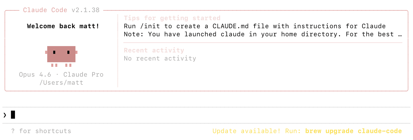
Navigate to your project directory in the terminal and type “claude” to launch your first session. On first launch, Claude Code opens a browser window asking you to authenticate. Sign in with your Claude Pro, Max, or Anthropic Console account. After authentication, you return to your terminal and Claude Code is ready.
If the browser does not open automatically, copy the URL displayed in your terminal and paste it into your browser. This is common on WSL and headless server environments. Once authenticated, credentials are stored locally so future launches start immediately.
For API key authentication instead of browser-based OAuth, set the ANTHROPIC_API_KEY environment variable in your shell. Add the export line to your shell configuration file (.zshrc on macOS, .bashrc on Linux) to persist it across sessions. Get your API key from the Anthropic Console at console.anthropic.com.
Setting Up CLAUDE.md
CLAUDE.md is the most important configuration file for getting good results. It is a Markdown file that Claude Code reads at the start of every session, containing your coding standards, architecture decisions, preferred libraries, common commands, and any instructions you want Claude to follow consistently.
Run /init in a Claude Code session to generate a CLAUDE.md with recommended defaults. Claude Code analyzes your project structure and creates a starting configuration you can customize. Alternatively, create the file manually in your project root.
CLAUDE.md works in a hierarchy. A global file at ~/.claude/CLAUDE.md applies to all projects and is a good place for personal coding preferences. A project-level file at ./CLAUDE.md in your repo root contains project-specific instructions. You can add CLAUDE.md files in subdirectories for component-specific guidance. More specific settings override more general ones.
Include your preferred languages and frameworks, naming conventions, testing expectations, directory structure explanations, deployment procedures, and review checklists. The more context you provide, the better Claude Code aligns with your workflow.
Configuring Permissions and Security
Claude Code asks for permission before executing impactful actions like writing files and running shell commands. You can pre-configure allowed tools in your settings.json file to avoid repeated prompts. For example, allow read operations and git commands while requiring approval for file writes and arbitrary bash commands.
Settings.json also lets you configure model preferences, maximum token limits, and hooks that run shell commands before or after Claude Code actions. You might set up a hook that auto-formats code after every file edit, or runs your linter before every commit. WSL 2 installations support sandboxing for enhanced security, isolating command execution in a controlled environment.
Setting Up Custom Slash Commands
Create custom slash commands to package repeatable workflows your team can share. Store definitions in .claude/commands/ for project-specific commands or ~/.claude/commands/ for personal commands across all projects. For example, a /review-pr command that runs a standard code review workflow, or a /deploy-staging command for your deployment checklist. These save time and tokens by packaging multi-step instructions into a single shortcut.
How to Check Claude Code Usage
Use the /cost command during a session to see your current token usage, duration, and estimated cost. For API users paying per token, this is essential for budget tracking. For subscription users, /cost shows consumption but does not directly relate to billing since your cost is fixed monthly.
For teams, administrators can view detailed cost and usage reporting in the Anthropic Console. When you first authenticate with a Console account, a workspace called “Claude Code” is automatically created for centralized tracking. You can set spend limits on this workspace to prevent unexpected costs.
The status line can be configured to display token usage continuously, so you always know how much context you are consuming. This helps you decide when to use /compact to reduce context size or /clear to start fresh. For a full cost analysis and plan comparison, see our Claude Code pricing guide.
How to Update Claude Code
If you installed using the native installer, updates happen automatically in the background. Claude Code checks for updates on startup and periodically while running, downloads, and installs them without any action from you. You see a notification when updates are installed.
For Homebrew installations on macOS, auto-update is not supported. Run “brew upgrade claude-code” periodically. For WinGet on Windows, run “winget upgrade Anthropic.ClaudeCode” to update. Setting a recurring reminder to check weekly or biweekly is good practice for these methods.
To force an immediate update check on any installation type, run “claude update.” Check your current version with “claude –version” and compare against the latest release on the Claude Code GitHub repository or npm page.
How to Upgrade Your Claude Code Plan
Upgrading from Pro to Max or between Max tiers happens through your account settings on claude.ai. The change takes effect immediately with new usage limits applying to your current session. No reinstallation or reconfiguration is needed since Claude Code automatically detects your subscription level. For help choosing a plan, see our pricing breakdown.
Running Claude Doctor for Diagnostics
If something seems wrong, run “claude doctor” to check your installation. It verifies installation type, version, configuration, authentication status, and connectivity. The output identifies common issues like outdated versions, missing PATH entries, or configuration errors, and suggests fixes. This is the first thing to try when Claude Code behaves unexpectedly.
How to Uninstall Claude Code
If you need to remove Claude Code for a clean reinstall or to switch installation methods, the process depends on how you installed it.
For native installations on macOS and Linux, remove the Claude Code binary and the version data directory. For WinGet installations on Windows, use the WinGet uninstall command or standard Windows app removal. For WSL, uninstall from within your Linux environment using the Linux removal process. For Homebrew, use the brew uninstall command. For deprecated npm installations, use npm uninstall with the global flag.
Uninstalling removes the binary but not your configuration files. To do a complete clean removal, also delete the ~/.claude directory and ~/.claude.json file, which contain your settings, allowed tool configurations, MCP server configurations, and session history. On Windows, these are in your user profile directory. Project-specific settings live in .claude/ and .mcp.json within each project folder.
If you have IDE extensions installed in VS Code, Cursor, or JetBrains, uninstall those separately through each editor’s extension manager.
For most troubleshooting scenarios, running “claude doctor” first is better than jumping straight to a full uninstall and reinstall. But when you do need a fresh start, removing everything including configuration files and then following the installation guide again is the most reliable path.
Next Steps
With Claude Code set up and configured, you are ready to start building. Our complete guide to using Claude Code covers practical workflows, essential commands, and tips for effective daily use. For terminal-specific workflows, see how to use Claude Code in the terminal. To understand the technical details of how it all works, read how Claude Code works under the hood.
How to Use Claude Code in the Terminal: Commands, Shortcuts, and Automation
The terminal is where Claude Code is most powerful. Running directly in your command line, it reads your project files, executes commands, and modifies your codebase through natural language conversation. This guide covers everything specific to the terminal experience, from launching and exiting sessions to pipeline automation and multi-agent workflows.
If you have not installed Claude Code yet, follow our installation guide first. For a broader overview of all Claude Code capabilities beyond the terminal, see the complete usage guide.
Navigate to your project directory and type “claude” to launch an interactive session. Claude Code reads your project structure, loads any CLAUDE.md configuration files, and connects to configured MCP servers. You will see a prompt indicator where you can start typing natural language requests.
If this is your first time, Claude Code opens a browser window for authentication. Sign in with your account and return to the terminal. Future launches skip this step. For detailed authentication options, see our setup and configuration guide.
To start with a specific prompt without entering interactive mode, use “claude -p” followed by your prompt in quotes. This is useful for quick one-off tasks and scripting. To resume your most recent conversation, use “claude -c” which picks up exactly where you left off.
How to Run Claude Code in the Terminal
Once your session is active, type requests in plain English at the prompt. Claude Code might read files to understand context, propose edits shown as diffs, or suggest terminal commands to execute. You approve or reject each action.
Reference specific files using @ followed by the path. “@package.json explain the dependencies” focuses Claude on that file. Reference directories like “@src/components/ what does each component do” to scope analysis. If you do not know the exact path, Claude Code can search for it.
Run shell commands directly by prefixing with an exclamation mark. “!git status” shows your git status, “!npm test” runs tests, “!ls -la” lists files. This executes the command directly rather than going through Claude’s conversational interface, which is faster and uses fewer tokens.
Essential Terminal Commands and Shortcuts
The /clear command resets conversation context. Use it when switching tasks so you are not paying for stale context. The /compact command summarizes your conversation to reduce context size while preserving important details. You can customize what to keep with “/compact Focus on the API changes we discussed.” The /cost command shows token usage and estimated cost.
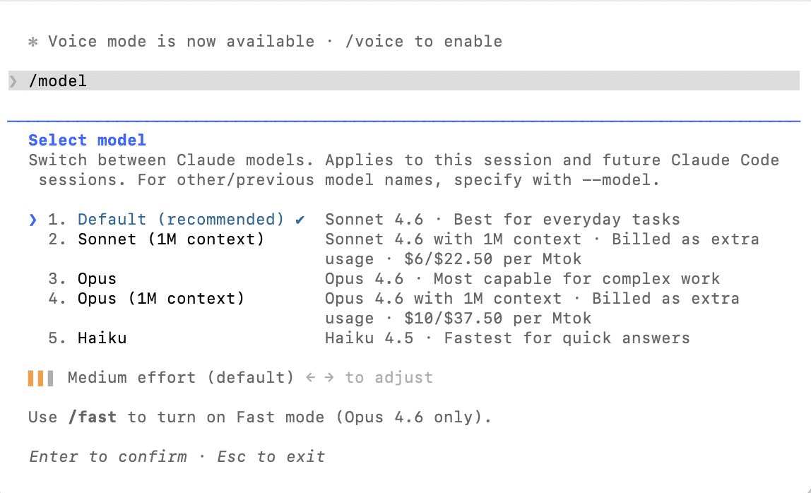
The /model command switches AI models during your session. “/model sonnet” for faster, cheaper responses. “/model opus” for the most capable reasoning. The /init command generates a CLAUDE.md for your project. The /help command lists everything available including custom commands.
Tab completion works for file paths and slash commands. Command history with the up arrow recalls previous prompts. Word deletion with Option-Delete and word navigation with Option-Arrow work on most systems.
How to Exit Claude Code
Type /exit at the prompt or press Ctrl+C to end a session. To pause and return later, use /exit and then “claude -c” next time to resume. Ctrl+D sends an end-of-input signal that also closes the session.
If Claude Code is in the middle of a long operation, press Ctrl+C once to cancel the current action without exiting. Press Ctrl+C again or type /exit to close entirely. Conversation history is preserved automatically for later resumption.
Running Claude Code for Automation and Pipelines
The non-interactive “claude -p” mode is designed for scripting and CI/CD. Pipe input to Claude Code and capture its output, composing it with other Unix tools. Practical examples include monitoring logs with “tail -f app.log | claude -p ‘alert me if there are anomalies'” and reviewing changed files with “git diff main –name-only | claude -p ‘review these files for security issues.'”
For CI/CD integration, Claude Code can review pull requests, generate changelogs, check code quality, or automate anything that benefits from AI understanding of your codebase. The pipeline mode outputs to stdout, making it easy to capture results in automation scripts.
Working With Multiple Sessions and Agents
Run multiple Claude Code sessions simultaneously in different terminal windows or tabs. Each maintains its own conversation context and works on different tasks. The /teleport command moves a session between surfaces, such as from your terminal to the Claude desktop app for visual diff review.
Claude Code supports spawning sub-agents for parallel work. A lead agent coordinates multiple instances, each with its own context window, working on different parts of a large task simultaneously. This is powerful for big refactoring jobs or feature implementations spanning many files.
Terminal Tips for Better Results
Keep your terminal window at least 100 columns wide. Claude Code renders diffs and code snippets that look best with this width, and narrow windows can cause rendering issues. Use a modern terminal emulator: Terminal or iTerm2 on macOS, Windows Terminal on Windows, or any modern terminal on Linux. The terminal should support ANSI colors and Unicode for proper diff and status rendering.
For extended sessions, monitor context with /cost and use /compact when it grows large. Long conversations accumulate tokens and become more expensive per message. Starting fresh with /clear when switching tasks is the most cost-effective habit. For more on managing costs, see our pricing guide.
To understand what happens behind the scenes when you interact with Claude Code, and how to extend it with external tools through MCP, read how Claude Code works.
How to Use Claude Code: A Practical Guide for Developers
Claude Code is a powerful AI coding assistant, but getting the most out of it requires understanding its workflows, commands, and best practices. This guide covers everything from basic interactions to advanced techniques that will help you use Claude Code effectively in your daily development work.
If you have not installed Claude Code yet, start with our installation guide for Mac, Windows, and Linux. For background on what the tool does, see what is Claude Code.
Open your terminal, navigate to your project directory, and type “claude” to launch an interactive session. Claude Code reads your project files and understands the structure of your codebase from the start. You type natural language requests at the prompt, and Claude Code responds by reading files, proposing changes, and executing commands with your approval.
A good first interaction is asking Claude Code to explain your codebase. Type something like “give me an overview of this project’s architecture” and it analyzes your files and provides a summary. This helps you see what Claude Code understands and gives you a baseline for more complex requests.
Essential Commands You Should Know
Claude Code includes built-in slash commands that control its behavior. The /init command generates a CLAUDE.md configuration file for your project. The /clear command resets your conversation context, essential when switching between unrelated tasks to avoid wasting tokens on stale information. The /cost command shows your current session’s token usage. The /compact command summarizes your conversation history to free up context window space while preserving important details.
The /model command switches between AI models mid-session. Sonnet is the default and handles most coding tasks efficiently at lower cost. Opus provides the most capable reasoning for complex decisions. Use /help to see all available commands including custom ones you have created.
Use the @ symbol to reference specific files or directories. For example, “@src/api/users.js explain the authentication flow” directs Claude Code to focus on that file. Execute shell commands within a session by prefixing them with an exclamation mark. “!npm test” runs your test suite without leaving the conversation and costs fewer tokens than asking Claude to do it conversationally. For a deep dive into terminal-specific techniques, see how to use Claude Code in the terminal.
Common Development Workflows
For bug fixes, describe the problem and let Claude Code investigate. It reads error messages, traces through your code, identifies the root cause, and proposes a fix as a diff you review and approve. For feature implementation, describe what you want built and Claude Code creates or modifies the necessary files.
For code reviews, ask Claude Code to review recent changes or a specific file. It checks for security vulnerabilities, performance problems, and maintainability concerns. For refactoring, describe the transformation you want and Claude handles multi-file changes.
Git workflows are another strong use case. Claude Code stages changes, writes commit messages, creates branches, and opens pull requests when connected to GitHub through MCP. Tell it “commit these changes with a descriptive message” and it handles the operations. Learn how to connect these external tools in our guide on how Claude Code works and how to extend it with MCP.
How to Use Claude Code Effectively
Be specific in your requests. Instead of “fix this code,” say “the login endpoint returns a 500 error when the email field is empty. Find and fix the missing validation.” The more context you provide upfront, the better the results.
Use CLAUDE.md files to give Claude Code persistent context about your project. Include coding standards, preferred libraries, architecture decisions, and review checklists. Claude Code reads these at the start of every session, so you do not need to repeat this information in every prompt. For details on setting this up, see our setup and configuration guide.
Clear context between unrelated tasks using /clear. Stale context wastes tokens on every subsequent message. Use /rename before clearing so you can find the session later, then /resume to return when needed.
Switch models based on task complexity. Use Sonnet for writing tests, fixing lint errors, and generating boilerplate. Switch to Opus for complex multi-step reasoning, architectural decisions, and debugging subtle issues.
Using Claude Code in Your IDE
The terminal is the primary interface, but Claude Code also integrates with VS Code, Cursor, Windsurf, and JetBrains IDEs. These extensions show proposed changes as visual diffs, let you share selected code as context, and provide a sidebar panel for interaction without leaving your editor. For complete setup instructions and IDE-specific tips, see our dedicated guide on using Claude Code in VS Code and Cursor.
Non-Interactive Mode and Automation
Claude Code supports non-interactive mode for scripting and CI/CD integration. Run “claude -p” followed by a quoted prompt to get a single response piped to stdout. This enables workflows like monitoring logs with “tail -f app.log | claude -p ‘alert me if you see anomalies'” or reviewing changes with “git diff main –name-only | claude -p ‘review these files for security issues.'”
You can also automate translations, generate documentation, run bulk operations across files, and integrate Claude Code into any automated pipeline. This composability is what makes it fundamentally different from chat-based AI assistants.
Managing Costs While Using Claude Code
Claude Code consumes tokens for each interaction, with costs varying by codebase size, query complexity, and conversation length. Use /cost to monitor usage and /compact to reduce context when it grows large. Clearing context between tasks and choosing Sonnet over Opus for routine work are the most effective ways to keep costs down.
For a full breakdown of subscription plans, API pricing, and cost optimization strategies, read our Claude Code pricing guide. To understand the technical underpinnings of token usage and context windows, see how Claude Code works.
Claude Code Security: Everything You Need to Know Before Getting Started

A practical guide to how Claude Code works, who can use it, how to access it securely, and what you should know about permissions, data handling, and safe usage.
IN THIS GUIDE
1. What Is Claude Code?
2. Who Can Use Claude Code?
3. How to Access & Install Claude Code
4. Understanding the Security Model
5. Permissions & What Claude Code Can Do
6. Data Privacy & How Your Code Is Handled
7. Security Best Practices
8. Frequently Asked Questions
1. WHAT IS CLAUDE CODE?
Claude Code is Anthropic’s command-line tool for agentic coding. Unlike the web-based Claude.ai chat interface, Claude Code runs directly in your terminal and can interact with your local codebase — reading files, writing code, running commands, and managing project tasks on your behalf.
Think of it as having an AI pair programmer that sits inside your development environment. You give it natural language instructions like “refactor the authentication module to use JWT tokens” or “find and fix the bug causing the test suite to fail,” and Claude Code handles the implementation, working across your files and project structure.
This is a fundamentally different interaction model from chatting in a browser. Because Claude Code operates locally on your machine with access to your filesystem and terminal, understanding its security model is essential before you start using it.
Key capabilities at a glance:
Terminal-Native — Runs directly in your command line, not in a browser window.
File System Access — Reads, writes, and modifies files in your project directory.
Command Execution — Can run shell commands, scripts, and development tools.
Permission Controls — Configurable approval system for different action types.
2. WHO CAN USE CLAUDE CODE?
Claude Code is designed for software developers, engineers, and technical teams who work with codebases regularly. It’s available to users on several Anthropic plan tiers, though availability and usage limits may vary.
Plan Availability
Claude Code is accessible to users with a Claude Pro, Team, or Enterprise subscription, and it’s also available to API users. The exact feature set and rate limits can differ depending on your plan. Since Anthropic frequently updates plan details and pricing, it’s best to check the Claude support page (https://support.claude.com) or the official documentation (https://docs.claude.com) for the most current information on what’s included in each tier.
Technical Requirements
Claude Code requires Node.js to be installed on your system. It’s distributed as an npm package, so you’ll need a working Node.js environment. It supports macOS and Linux as primary platforms. For Windows users, Claude Code works through Windows Subsystem for Linux (WSL).
[Note: You don’t need to be an expert in AI or prompt engineering to use Claude Code effectively. If you’re comfortable with a terminal and familiar with your project structure, you can be productive quickly. That said, understanding the security implications of giving an AI tool access to your filesystem is important — which is exactly what the rest of this article covers.]
3. HOW TO ACCESS & INSTALL CLAUDE CODE
Getting started with Claude Code is a straightforward process. Here’s a walkthrough of the core steps.
Step 1: Ensure Node.js Is Installed
Claude Code is an npm package, so you’ll need Node.js on your machine. If you don’t have it, download it from nodejs.org or use a version manager like nvm.
Step 2: Install via npm
Install Claude Code globally using npm. The package is @anthropic-ai/claude-code and can be found on npmjs.com (https://www.npmjs.com/package/@anthropic-ai/claude-code).
Step 3: Authenticate
After installation, you’ll need to authenticate with your Anthropic account. Claude Code will guide you through the authentication flow in your terminal.
Step 4: Navigate to Your Project & Start
Navigate to the root of the project you want to work in, then launch Claude Code. It will begin by understanding your project’s structure and context.
Terminal commands:
# Install Claude Code globally
npm install -g @anthropic-ai/claude-code
# Navigate to your project
cd /path/to/your/project
# Launch Claude Code
claude
[Important: Always verify the exact installation steps in the official Claude Code documentation (https://docs.claude.com/en/docs/claude-code/overview), as the process or package name may evolve over time.]
4. UNDERSTANDING THE SECURITY MODEL
Because Claude Code operates directly on your machine — reading your code, running commands, and writing files — Anthropic has built a security model around user consent and explicit approval. Here’s how to think about it.
The Approval System
Claude Code uses a permission system that requires your approval before it takes potentially impactful actions. When Claude Code wants to execute a shell command, write to a file, or perform other actions that modify your system, it presents the action for your review and waits for you to approve it before proceeding.
This means Claude Code won’t silently rewrite your files or run arbitrary commands. You stay in the loop and maintain control over what actually happens on your machine.
Trust Levels & Configuration
Claude Code supports configurable permission levels that let you decide how much autonomy to grant. You can keep things locked down with manual approval for every action, or allow certain categories of operations (like file reads) to proceed automatically. The documentation provides details on configuring these permission modes to match your security preferences and workflow.
[Key Principle: Claude Code follows a “human in the loop” design philosophy. The default behavior is to ask before acting. You choose how much latitude to give it, not the other way around.]
5. PERMISSIONS & WHAT CLAUDE CODE CAN DO
It’s worth being explicit about the types of actions Claude Code is capable of, so you can make informed decisions about when and how to use it.
What Claude Code Can Do
Read files — Claude Code can read any file within your project directory to understand context, review code, or analyze your project structure.
Write and edit files — It can create new files, modify existing ones, refactor code, and make edits across multiple files in a single operation.
Execute shell commands — Claude Code can run terminal commands like git, npm, build scripts, test suites, and other CLI tools available in your environment.
Interact with MCP servers — Claude Code supports the Model Context Protocol (MCP), which allows it to connect to external tools and services through standardized integrations. This extends its capabilities beyond your local filesystem.
What to Be Aware Of
Because Claude Code can run shell commands, it has the same level of access to your system as your terminal session does. This means it could theoretically install packages, modify system files (if you have permission), make network requests, or interact with services your machine has access to.
[Security Consideration: Always review the commands Claude Code proposes before approving them, especially commands that install packages, modify system-level configurations, or interact with production environments. Treat the approval prompt the same way you’d treat pasting a command from the internet into your terminal — with informed caution.]
6. DATA PRIVACY & HOW YOUR CODE IS HANDLED
One of the most common concerns developers have about AI coding tools is: “What happens to my code?” It’s a fair question, especially if you’re working on proprietary or sensitive projects.
How Conversations Are Processed
When you use Claude Code, your prompts and the relevant code context are sent to Anthropic’s API for processing. This is how Claude generates its responses and proposed actions. The data in transit is encrypted, and Anthropic has published usage policies that outline how data is handled.
Data Retention & Training
Anthropic’s data policies apply to Claude Code usage. The specifics around whether your inputs are used for model training, how long data is retained, and what protections are in place depend on your plan type (particularly for Enterprise and API users, who typically have stricter data handling agreements).
[Recommended: Review Anthropic’s current privacy policy and terms of service (https://www.anthropic.com) for the most accurate, up-to-date information on data handling. Enterprise and Team plans generally offer additional data protections and commitments. If you’re working with highly sensitive code, this is worth investigating before adoption.]
Working with Sensitive Projects
If you’re working on projects with strict confidentiality requirements — government contracts, financial systems, healthcare data — talk to your security team before adopting Claude Code. Consider what code and context is being sent externally, whether your compliance requirements allow third-party AI tool usage, and what data handling agreements your plan provides.
7. SECURITY BEST PRACTICES
Here are practical recommendations for using Claude Code securely in your day-to-day workflow.
Start with Restrictive Permissions
When you first start using Claude Code, keep the approval requirements tight. Manually review every file write and shell command until you’re comfortable with the types of actions it proposes. You can loosen permissions over time as you build confidence in the tool’s behavior within your specific workflow.
Be Mindful of Environment Variables & Secrets
Claude Code can read files in your project directory, including .env files, configuration files with API keys, and other sensitive data. Make sure your .gitignore practices are solid and consider whether files containing secrets should be accessible in the directories where you run Claude Code.
Review Before Approving
This one is simple but critical: actually read the commands and file changes Claude Code proposes. Don’t rubber-stamp approvals. The tool is powerful and generally makes good suggestions, but every automated system can produce unexpected results — especially with complex or ambiguous instructions.
Use Version Control
Always work in a Git repository (or equivalent version control system) when using Claude Code. This gives you a safety net: if Claude Code makes changes you don’t like, you can easily review diffs and revert. Commit your work before starting a Claude Code session so you have a clean baseline to compare against.
Scope Your Sessions
Rather than giving Claude Code access to your entire home directory, navigate to the specific project you’re working on. This limits the scope of files it can read and reduces the surface area of potential unintended changes.
Keep It Updated
Like any security-relevant tool, keep Claude Code updated to the latest version. Anthropic regularly releases updates that may include security improvements, bug fixes, and new permission controls.
8. FREQUENTLY ASKED QUESTIONS
Q: Is Claude Code free to use?
A: Claude Code is included with certain Anthropic plans (Pro, Team, Enterprise) and is also available to API users. The exact pricing, rate limits, and usage caps depend on your plan. Check the Claude support page (https://support.claude.com) for current pricing details.
Q: Can Claude Code access the internet or make network requests?
A: Claude Code can execute shell commands, which means it could potentially make network requests if it runs commands like curl, npm install, or similar tools. This is why the approval system is important — you’ll see the command before it runs and can decline anything you’re not comfortable with.
Q: Does Claude Code send my entire codebase to Anthropic’s servers?
A: Claude Code sends relevant context to the API as needed to respond to your prompts — not your entire codebase at once. However, over the course of a session it may read and send multiple files as it builds understanding of your project. If you’re working with sensitive code, review Anthropic’s data handling policies and consider whether an Enterprise plan’s data protections align with your requirements.
Q: Can I use Claude Code on Windows?
A: Claude Code supports macOS and Linux natively. For Windows, you can use it through Windows Subsystem for Linux (WSL). Native Windows support is not currently available, though this may change — check the official docs for the latest platform support information.
Q: What is MCP, and should I be concerned about it?
A: MCP (Model Context Protocol) is a standardized way for Claude Code to connect with external tools and services — things like databases, APIs, or development platforms. It extends what Claude Code can do beyond your local files. MCP server integrations are configurable, and you control which ones are active. Only enable MCP connections to tools and services you trust and need for your workflow.
Q: Can Claude Code accidentally delete my files or break my project?
A: Like any tool that writes files and runs commands, there’s always some risk of unintended changes. This is why the approval system exists and why version control is essential. If you’re using Git and reviewing proposed changes before approving them, you can always revert anything problematic. Start with restrictive permissions and work in branches for extra safety.
Q: Is Claude Code suitable for enterprise and regulated environments?
A: Anthropic offers Enterprise plans with additional security features, data handling commitments, and compliance support. If you’re in a regulated industry, engage with Anthropic’s enterprise sales team to understand what protections are available. Visit anthropic.com/contact-sales for more information.
Q: How does Claude Code compare to GitHub Copilot or Cursor?
A: While all three are AI coding tools, they differ in form factor. GitHub Copilot is primarily an IDE extension that offers inline code completions. Cursor is a full AI-native code editor. Claude Code is a command-line tool that operates as an agentic assistant — it can execute multi-step tasks, run commands, and manage file operations autonomously (with your approval). The right choice depends on your preferred workflow and how much autonomy you want your AI assistant to have.
Q: Where can I find the most up-to-date Claude Code documentation?
A: The official Claude Code documentation is maintained at docs.claude.com/en/docs/claude-code/overview. For general account and billing questions, visit support.claude.com. The npm package page at npmjs.com (https://www.npmjs.com/package/@anthropic-ai/claude-code) also includes installation and release information.
“`
How to Install OpenClaw on DigitalOcean (Cloud VPS Setup Guide)
Running OpenClaw (formerly Clawdbot / Moltbot) on a cloud VPS instead of your personal computer is one of the smartest deployment choices you can make. A DigitalOcean Droplet gives you an always-on server with a static IP, predictable networking, and complete isolation from your personal machine — which means your AI agent runs 24/7 without tying up your laptop or risking your personal files.
DigitalOcean has become one of the most popular hosting choices for OpenClaw, and they even offer a 1-Click Deploy option from their Marketplace that handles the heavy lifting for you. This guide covers both the 1-Click approach and the manual setup, so you can choose whichever fits your comfort level.
If you’re not familiar with OpenClaw yet, start with our guide to what OpenClaw is and how it works. If you’d rather run it locally, we have installation guides for Mac and Windows.
Why Run OpenClaw on a Cloud VPS?
Running OpenClaw locally on your Mac or PC works great, but a cloud deployment solves several common pain points.
Always available. A Droplet runs 24/7 without depending on your laptop being open, plugged in, or connected to the internet. Your AI agent stays active while you sleep, travel, or close your computer.
Security isolation. Your AI agent runs on a separate machine with no access to your personal files, passwords, or accounts. If something goes wrong, your personal computer is unaffected. This is a major advantage given the security considerations around OpenClaw.
Static IP and stable networking. Unlike your home network where the IP can change and ports may be blocked, a Droplet has a fixed public IP address. This makes remote access and messaging integrations more reliable.
Scalable resources. If your agent’s workload grows — more skills, more channels, browser automation — you can vertically scale the Droplet’s CPU and RAM without starting over.
Option A: 1-Click Deploy from the DigitalOcean Marketplace
The fastest way to get OpenClaw running on DigitalOcean is their 1-Click Deploy, available in the DigitalOcean Marketplace. This provisions a security-hardened Droplet with OpenClaw pre-installed, including Docker for sandboxed execution, firewall rules, non-root user configuration, and a gateway authentication token.
Step 1: Deploy the 1-Click App
Log into your DigitalOcean account and navigate to the Marketplace. Search for “OpenClaw” and click “Create OpenClaw Droplet.” You’ll be prompted to choose a Droplet size and region.
For Droplet size, the minimum recommended is 2 vCPUs with 2GB RAM. The 1-Click image currently requires a minimum $24/month Droplet to match the snapshot’s disk and memory requirements, though DigitalOcean is working on reducing this. If budget is a concern, you can try a smaller Droplet with the manual setup method described in Option B.
Choose a datacenter region close to you for the best latency. Add your SSH key during creation — you’ll need it to log in.
Step 2: SSH Into Your Droplet
Wait for the Droplet to finish provisioning. Note that the DigitalOcean dashboard may say “ready” before SSH is actually available — if the connection fails, wait 60 seconds and try again.
ssh root@your-droplet-ip
You’ll see a welcome message from OpenClaw with setup instructions.
Step 3: Configure Your AI Provider
The welcome screen will walk you through initial configuration. You’ll need to choose your AI provider (Anthropic, OpenAI, or Gradient AI) and paste your API key. After entering the key, the OpenClaw service will restart automatically to apply the changes.
Note the Dashboard URL displayed in the welcome message — you’ll use this to access the web-based Control UI from your browser.
Step 4: Access the Dashboard
Open the Dashboard URL in your browser. The 1-Click deployment sets up Caddy as a reverse proxy with automatic TLS certificates from Let’s Encrypt — even for bare IP addresses without a domain name. This means your dashboard connection is encrypted out of the box.
You’ll need to complete the pairing process when first accessing the dashboard. Follow the on-screen instructions to pair your browser.
Step 5: Connect a Messaging Channel
From the dashboard or via SSH, connect your preferred messaging platform. The process is the same as any OpenClaw installation — create a Telegram bot via @BotFather, scan a QR code for WhatsApp, or configure Discord/Slack webhooks.
Once connected, send a test message to confirm everything is working.
Option B: Manual Setup on a Fresh Droplet
If you prefer more control over the installation, or if you want a smaller/cheaper Droplet, you can set up OpenClaw manually on a fresh Ubuntu server.
Step 1: Create a Droplet
Create a new Droplet in the DigitalOcean control panel with the following specs:
Image: Ubuntu 24.04 LTS
Size: At least 2 vCPUs and 2GB RAM (the Basic plan at ~$18/month works well). A 1GB Droplet can work with a swap file but may run out of memory during npm install.
Region: Choose the datacenter closest to you.
Authentication: Add your SSH key.
Step 2: Initial Server Setup
SSH into your new Droplet:
ssh root@your-droplet-ip
Update packages:
apt update && apt upgrade -y
Create a swap file (important for smaller Droplets to prevent out-of-memory errors during installation):
sudo fallocate -l 2G /swapfile
sudo chmod 600 /swapfile
sudo mkswap /swapfile
sudo swapon /swapfile
echo '/swapfile none swap sw 0 0' | sudo tee -a /etc/fstab
Step 3: Create a Dedicated User
Running OpenClaw as root is a bad idea. Create a dedicated user with limited permissions:
adduser openclaw
usermod -aG sudo openclaw
su - openclaw
This ensures the AI runtime doesn’t have root-level access to your system. If a skill misbehaves, the damage is contained to this user’s permissions.
Step 4: Install Node.js 22
curl -fsSL https://deb.nodesource.com/setup_22.x | sudo -E bash -
sudo apt-get install -y nodejs
Verify:
node --version
Step 5: Install and Configure OpenClaw
npm install -g openclaw@latest
openclaw onboard --install-daemon
The onboarding wizard will prompt for your model provider, API key, and messaging channel configuration — the same process as a local installation.
Step 6: Configure Firewall Rules
Set up UFW to restrict inbound access:
sudo ufw default deny incoming
sudo ufw default allow outgoing
sudo ufw allow OpenSSH
sudo ufw enable
Do not expose port 18789 (the gateway) publicly unless you have a specific reason and have set up proper authentication and a reverse proxy. For personal use, access the dashboard via SSH tunnel instead.
Step 7: Verify the Installation
openclaw doctor
openclaw status
If both return healthy results, your cloud-hosted OpenClaw is live.
VPS-Specific Configuration Tips
Running OpenClaw on a headless VPS introduces a few differences compared to a local desktop setup. Here are the most important things to get right:
Set execution host to gateway. On a VPS, there’s no terminal window open for OpenClaw to run commands in. The gateway process serves as the execution environment. Make sure tools.exec.host is set to gateway in your configuration, or commands will fail silently.
Disable execution consent prompts. On a local machine, consent prompts are a safety feature — OpenClaw asks “are you sure?” before running commands, and you approve them. On a headless VPS, there’s nobody sitting at a terminal to approve anything. Set tools.exec.ask to off or commands will hang indefinitely waiting for input. Compensate by being more careful about which skills you install and which permissions you grant.
Set security level appropriately. The tools.exec.security setting controls what OpenClaw is allowed to do. On a dedicated VPS where you control what’s installed, setting this to full is typically appropriate — without it, OpenClaw can’t call APIs, fetch URLs, or reach any external service. On a shared machine, keep it more restrictive.
Configuration lives in /opt/openclaw.env. On the 1-Click deployment, the main configuration file is at /opt/openclaw.env and is owned by root. The openclaw user intentionally cannot modify its own configuration — this is a security feature that prevents a misbehaving skill from changing API keys or redirecting outputs. Edit it as root with sudo nano /opt/openclaw.env and restart the service after changes.
Restart the service after config changes. Changes to the environment or configuration don’t take effect until you restart: sudo systemctl restart openclaw
Remote Access Options
SSH tunnel (recommended for personal use): Access the dashboard without exposing it publicly by forwarding the port through SSH: ssh -L 18789:localhost:18789 openclaw@your-droplet-ip, then open http://localhost:18789 in your browser.
Tailscale (recommended for multi-device access): Install Tailscale on both your Droplet and your devices to create a private, encrypted network. Your OpenClaw instance gets a private Tailscale address and remains inaccessible from the public internet.
Messaging only (simplest): If you’ve connected Telegram, WhatsApp, or another messaging channel, you don’t need to access the dashboard at all for day-to-day use. Just interact with your agent through chat.
Cost Expectations
Your total cost for running OpenClaw on DigitalOcean has two components:
Droplet hosting: The 1-Click deployment starts at $24/month (due to the current image size requirements). Manual setup on a smaller Droplet can start around $12-18/month with 2GB RAM. A 1GB Droplet ($6/month) can work for light use with a swap file configured.
AI model API costs: These depend on your provider and usage. Claude Haiku is the most cost-effective for everyday tasks, while Claude Opus is more capable but pricier. Typical personal use runs anywhere from $5-50/month in API costs depending on how active your agent is.
What to Do After Installation
Once your cloud-hosted OpenClaw is running, explore our guide to 10 practical things you can do with OpenClaw. Cron jobs and proactive automation are particularly well-suited to a VPS deployment since your agent is always on and always connected.
And don’t skip the security basics — read our OpenClaw security guide for best practices on running an AI agent safely, especially in a cloud environment.
Related Guides on Code Boost
What Is OpenClaw (Formerly Clawdbot)? The Self-Hosted AI Assistant Explained
How to Install OpenClaw on Windows (Step-by-Step WSL2 Guide)
How to Install OpenClaw on Mac (macOS Setup Guide)
Is OpenClaw Safe? Security Guide for Self-Hosted AI Agents
OpenClaw (formerly Clawdbot / Moltbot) gives you something powerful: an AI assistant that can read your files, run commands on your computer, access your email, manage your calendar, and communicate through your messaging apps. That power comes with real security implications that every user needs to understand before diving in.
This guide covers the known security concerns, the built-in safeguards OpenClaw provides, and the best practices you should follow to run it responsibly. Whether you’ve already installed OpenClaw on your Mac or set it up on Windows, this is essential reading.
New to OpenClaw? Start with our overview of what OpenClaw is before reading this security guide.
The Core Security Tradeoff
OpenClaw’s entire value proposition creates a natural tension with security. For an AI agent to actually do useful things — manage your inbox, organize files, run shell commands, automate browser tasks — it needs broad access to your system. The more capable you want it to be, the more permissions it needs.
This is fundamentally different from a cloud-based chatbot like ChatGPT, which runs in a sandboxed browser environment and can’t touch your local files. OpenClaw trades that isolation for capability. You get an AI that can act on your behalf, but you also get an AI that has the same access to your system as your user account.
The question isn’t whether OpenClaw is perfectly safe — no tool with this level of system access is. The question is whether you understand the risks and are taking appropriate steps to manage them.
What Security Researchers Have Found
OpenClaw’s rapid rise in popularity has attracted scrutiny from cybersecurity firms and researchers. Here’s what’s been reported:
Cisco’s AI security team tested a third-party OpenClaw skill and found it performed data exfiltration and prompt injection without user awareness. Their finding highlighted that the ClawHub skill repository lacked adequate vetting to prevent malicious submissions at the time.
Palo Alto Networks warned that OpenClaw presents a dangerous combination of risks stemming from its access to private data, exposure to untrusted content (like messages from the web or group chats), and ability to perform external communications while retaining memory. They described this as a high-risk mix for autonomous agents.
One of OpenClaw’s own maintainers publicly cautioned on Discord that if someone can’t understand how to run a command line, this is too dangerous of a project for them to use safely.
These aren’t theoretical concerns. An AI agent with shell access, internet connectivity, and persistent memory creates a real attack surface, especially when it can receive messages from external sources like group chats or unknown contacts.
OpenClaw’s Built-In Security Features
The OpenClaw project does include several security mechanisms. Understanding what they do — and what they don’t — is important.
DM Pairing System. Unknown senders who message your bot receive a pairing code that you must manually approve via the CLI before the assistant will respond. This prevents random people from controlling your agent.
Loopback Binding. By default, the gateway listens on 127.0.0.1 (localhost only), meaning it’s not exposed to your local network or the internet. Only processes on the same machine can reach it.
Gateway Authentication Token. Even local connections require a token generated during setup. This prevents unauthorized access to the admin dashboard and API.
Sandboxed Execution. Non-main sessions can run in Docker containers, isolating them from your primary system. This is configured via the sandbox setting in your agent configuration.
Execution Consent Mode. When exec.ask is set to “on” in your configuration, OpenClaw will prompt for your approval before running write operations, shell commands, or other potentially destructive actions.
Group Chat Safeguards. In group chats, OpenClaw requires an @mention to respond by default, preventing it from reacting to every message in a channel. Group commands are restricted to the owner.
Open Source and Auditable. All of OpenClaw’s code is published under the MIT license. Anyone can review it, and the developer community has been actively auditing the codebase.
Best Practices for Running OpenClaw Safely
Beyond the built-in features, here are the steps you should take to minimize risk:
Use a Dedicated Machine or User Account
The strongest recommendation from the security community is to avoid installing OpenClaw on your primary personal computer — especially one with sensitive documents, financial accounts, or credentials. Ideally, run it on a dedicated device (a Mac Mini, a Raspberry Pi, or a cloud VPS like DigitalOcean), or at minimum create a separate macOS/Linux user account with limited permissions.
Keep the Gateway Bound to Localhost
Make sure your gateway is configured to bind to 127.0.0.1, not 0.0.0.0. Check your openclaw.json configuration to verify. Binding to 0.0.0.0 exposes the gateway to your entire network, which is rarely necessary for personal use.
Enable Execution Consent Mode
Set exec.ask: "on" in your configuration so OpenClaw asks for explicit approval before executing shell commands, deleting files, running Git operations, or performing other write actions. This is especially important when you’re still learning how the tool works.
Vet Every Community Skill Before Installing
ClawHub skills are community-contributed and have historically lacked rigorous security vetting. Before installing any third-party skill, review its source code. Cisco has released a Skill Scanner tool specifically for checking OpenClaw skills for malicious behavior — use it. Never blindly install a skill just because it’s popular or highly starred.
Store API Keys Securely
Never hardcode API keys in configuration files or leave them in plaintext on disk. Use OpenClaw’s built-in credential storage system, or better yet, use a secrets manager like Bitwarden CLI. Don’t commit credentials to repositories, and don’t leave them in your shell history.
Set Up Firewall Rules
If you’re running OpenClaw on a Linux server or VPS, configure your firewall to minimize the attack surface:
sudo ufw default deny incoming
sudo ufw default allow outgoing
sudo ufw allow 22/tcp
sudo ufw enable
Only open the specific ports you actually need. Don’t expose port 18789 (the gateway) publicly.
Use Tailscale for Remote Access
If you need to access your OpenClaw instance remotely (from your phone while away from home, for example), use Tailscale or SSH tunnels rather than exposing the gateway port to the public internet. Tailscale creates a private, encrypted network between your devices.
Review Permissions Regularly
Periodically audit which integrations and channels you have connected, what skills are installed, and what permissions the agent has. Remove anything you’re not actively using. The principle of least privilege applies here — only give OpenClaw access to what it actually needs.
The Privacy Tradeoff: Local vs. Cloud
One of OpenClaw’s main selling points is privacy — your data stays on your machine instead of being sent to a cloud provider. This is a real benefit, especially compared to cloud-hosted AI assistants that process and store your data on their servers.
But “local-first” doesn’t mean “completely private.” If you’re using a cloud AI model (Claude, GPT-4, etc.), your conversation content is still being sent to that provider’s API for processing. Only the orchestration layer runs locally. For truly private inference, you’d need to use a local model through Ollama or a similar tool — though local models are generally less capable than their cloud counterparts.
The privacy benefit is about control: you choose what gets sent where, and your configuration, memory, and credentials never leave your machine.
Who Should (and Shouldn’t) Use OpenClaw
OpenClaw is best suited for developers, system administrators, and technically-savvy users who understand the security model and can manage the risks. If you’re comfortable with the command line, know how to read code, and can audit what’s running on your system, OpenClaw can be an incredibly powerful tool.
If you’re not comfortable evaluating the security implications of giving an AI agent shell access, or if you’re running it on a machine with sensitive personal data you can’t afford to have exposed, proceed with extreme caution — or wait until the ecosystem matures further.
The bottom line: OpenClaw is a powerful, useful tool when used responsibly. Treat it the way you’d treat any software that has broad access to your system — with respect, regular audits, and appropriate safeguards.
Related Guides on Code Boost
What Is OpenClaw (Formerly Clawdbot)? The Self-Hosted AI Assistant Explained
How to Install OpenClaw on Windows (Step-by-Step WSL2 Guide)
How to Install OpenClaw on Mac (macOS Setup Guide)
10 Things You Can Do With OpenClaw (Practical Use Cases and Examples)
OpenClaw (formerly Clawdbot / Moltbot) is an open-source AI assistant that runs on your own hardware and connects to your messaging apps. But once you’ve got it installed on your Mac or set up on Windows, the natural question is: what should I actually do with it?
Unlike traditional AI chatbots that just answer questions, OpenClaw is designed to take action. It can interact with your file system, run commands, browse the web, and connect to external services. Below are ten practical use cases that demonstrate what makes OpenClaw genuinely useful — along with example prompts you can send right through your messaging app.
Not sure what OpenClaw is? Read our complete guide to what OpenClaw is and how it works first.
1. Email Inbox Management
One of the most popular use cases is handing your inbox over to OpenClaw for triage. It can scan your emails, sort them by priority, summarize what needs your attention, and even draft responses for you to review.
Example prompts you might send via WhatsApp or Telegram:
"Clear my inbox of newsletters and promotional emails"
"Summarize the 5 most important emails I received today"
"Draft a reply to the email from Sarah about the project deadline"
OpenClaw connects to your email through configured integrations (Gmail, Outlook, etc.) and handles the sorting and drafting work. You review and approve before anything is sent.
2. Calendar Scheduling and Management
Instead of switching between apps to manage your calendar, you can manage it entirely through conversation. OpenClaw can check your availability, schedule meetings, resolve conflicts, and send confirmations — all from chat.
Example prompts:
"Schedule a meeting with the team next Tuesday at 3 PM"
"What does my calendar look like this week?"
"Move my Thursday afternoon meeting to Friday morning"
This is particularly powerful when combined with cron jobs (covered below), so OpenClaw can proactively send you a daily calendar summary each morning.
3. File and Folder Organization
OpenClaw has direct access to your file system (within your configured workspace), which means it can organize, rename, move, and summarize files on your behalf.
Example prompts:
"Organize my Downloads folder by file type"
"Summarize the PDF called report.pdf on my desktop"
"Find all files larger than 100MB in my home directory"
For developers, this extends to project-level tasks like cleaning up build artifacts, organizing assets, or sorting log files.
4. Browser Automation
OpenClaw can control a browser to perform tasks that would normally require you to manually navigate websites, fill out forms, and click through interfaces.
Example prompts:
"Book the cheapest flight to Berlin next month"
"Search for a 3-star hotel in Tokyo for the first week of April"
"Fill out the expense report form on our company portal"
The browser automation capabilities mean OpenClaw can handle tasks like searching, comparing, and filling forms — then report back with what it found or did. This is one of the features that led people to call OpenClaw “AI with hands.”
5. Shell Command Execution
For developers and system administrators, the ability to run shell commands through a messaging app is incredibly useful. You can manage your server, run scripts, check system health, and execute Git operations from your phone.
Example prompts:
"Run git pull on my project repo"
"Check how much disk space is left on this machine"
"Restart the Docker containers for my web app"
By default, OpenClaw prompts for consent before executing potentially dangerous commands. You can configure the exec.ask setting in your config to control which commands require approval and which can run automatically.
6. Scheduled Tasks and Proactive Reminders (Cron Jobs)
Unlike most AI assistants that only respond when spoken to, OpenClaw can run tasks on a schedule. This is one of its most distinctive features — it can proactively reach out to you through your messaging app with information or completed tasks.
Example prompts:
"Every morning at 8 AM, send me a summary of my calendar and top emails"
"Check my website for downtime every hour and alert me if it's down"
"Remind me every Friday at 5 PM to submit my timesheet"
Cron jobs turn OpenClaw from a reactive tool into a proactive assistant that works for you even when you’re not thinking about it.
7. Smart Home Control
If you have a smart home setup (HomeKit, Google Home, Alexa, SmartThings, or IFTTT), OpenClaw can serve as a natural language interface for controlling your devices.
Example prompts:
"Turn on the living room lights and set the temperature to 72°F"
"Set a routine to turn off all lights at 11 PM"
"Is the front door locked?"
The advantage over built-in voice assistants is that OpenClaw remembers your preferences, can chain multiple actions together, and operates through whatever messaging platform you prefer.
8. Research and Content Summarization
OpenClaw can search the web, read documents, and compile research summaries — then deliver the results directly to your chat.
Example prompts:
"Research the latest developments in AI agents and summarize the key trends"
"Read this PDF and give me the three most important takeaways"
"Compare the pricing of the top 5 project management tools"
With web search skills enabled, OpenClaw can pull in current information beyond its model’s training data, making it useful for market research, competitive analysis, and staying up to date on rapidly changing topics.
9. Custom Skills and ClawHub Extensions
OpenClaw’s skill system lets you extend its capabilities far beyond the defaults. ClawHub is the community skill registry where you can discover, install, and share skills with a single command.
To install a skill:
openclaw skill install <skill-name>
Community skills cover a wide range of functionality: monitoring cryptocurrency prices, tracking packages, posting to social media, integrating with project management tools, and much more. You can also build your own custom skills — just ask OpenClaw itself to help you create one.
Example prompt:
"Create a skill to monitor Hacker News for posts about AI agents and alert me when something hits the front page"
A word of caution: always vet community skills before installing them. Some have been found to contain malicious code. See our OpenClaw security guide for best practices on skill safety.
10. Coding Workflows and Developer Automation
For developers, OpenClaw pairs powerfully with coding tools. Some users run it alongside Claude Code or GitHub Copilot, using OpenClaw as the orchestration layer that delegates specific coding tasks to the right tool.
Example prompts:
"Run the test suite for my project and summarize any failures"
"Set up a Sentry webhook and automatically create PRs for critical errors"
"Review the latest PR on my repo and summarize the changes"
The multi-agent pattern is particularly interesting: you can configure separate OpenClaw agents for work and personal tasks, each with their own personality, permissions, and connected services. Some power users set up OpenClaw to autonomously run tests, capture errors, resolve them, and open pull requests — all while they sleep.
Getting the Most Out of OpenClaw
A few tips that apply across all these use cases:
Use natural language. OpenClaw doesn’t require rigid commands. Talk to it the way you’d talk to a capable colleague. The underlying AI model handles the interpretation.
Use /think high for complex tasks. This triggers deeper reasoning from the AI model, which helps with multi-step tasks that require planning.
Start with consent mode on. Especially when you’re new, keep the exec.ask setting enabled so OpenClaw asks for your approval before executing commands. You can relax this as you build trust.
Check /status regularly. The /status command shows your session info, model, token usage, and cost when available. It’s helpful for keeping track of API spending.
Customize SOUL.md. This file defines your assistant’s personality, tone, and boundaries. Editing it lets you shape how OpenClaw communicates with you — whether you want it professional, casual, or somewhere in between.
Ready to Install?
If you haven’t set up OpenClaw yet, we have step-by-step guides for every platform:
Install OpenClaw on Windows (WSL2)
Install OpenClaw on DigitalOcean
And make sure you understand the security implications before giving your AI assistant broad access to your system: Is OpenClaw safe? Read our security guide.
Related Guides on Code Boost
What Is OpenClaw (Formerly Clawdbot)? The Self-Hosted AI Assistant Explained
How to Install OpenClaw on Windows (Step-by-Step WSL2 Guide)
How to Install OpenClaw on Mac (macOS Setup Guide)
How to Install OpenClaw on Mac (macOS Setup Guide)
If you’re looking to run a self-hosted AI assistant on your Mac, OpenClaw (formerly Clawdbot / Moltbot) is one of the most capable options available. macOS is arguably the best platform for OpenClaw — the project was largely built around the Apple ecosystem, and it shows with native features like a menu bar companion app, Voice Wake for hands-free interaction, and iMessage integration that’s exclusive to macOS.
This guide walks you through the complete installation process on macOS, from prerequisites to a fully running AI assistant. If you’re not familiar with OpenClaw yet, start with our overview of what OpenClaw is and how it works.
Why macOS Is Ideal for OpenClaw
While OpenClaw supports macOS, Windows (via WSL2), and Linux, macOS provides the smoothest experience for several reasons. OpenClaw runs natively without any virtualization layer (unlike the WSL2 requirement on Windows). The companion menu bar app gives you quick access to settings, health status, and controls. Voice Wake lets you activate the assistant by saying “Hey Claw” on macOS, iOS, and Android. And iMessage integration — only available on macOS — lets you interact with OpenClaw through Apple’s messaging platform.
Many users run OpenClaw on a Mac Mini as a dedicated always-on AI server, which is a popular and well-documented setup in the community.
Prerequisites
macOS Ventura (13) or newer — Sonoma and Sequoia are ideal. Older versions may work but aren’t officially recommended.
Homebrew — The macOS package manager. If you don’t have it, we’ll install it in Step 1.
Node.js 22 or newer — Required for OpenClaw’s runtime. We’ll install this via Homebrew.
An API key from an AI model provider — Anthropic (Claude), OpenAI (GPT-4), Google (Gemini), or a local model via Ollama. Have your key ready before starting the onboarding wizard.
Basic Terminal familiarity — You’ll be running commands in the macOS Terminal app. Open it with Command + Space, then search for “Terminal.”
Step 1: Install Homebrew (If Needed)
If you already have Homebrew installed, skip to Step 2. Otherwise, open Terminal and run:
/bin/bash -c "$(curl -fsSL https://raw.githubusercontent.com/Homebrew/install/HEAD/install.sh)"
Follow the prompts. Once complete, verify with:
brew --version
Step 2: Install Node.js 22
OpenClaw requires Node.js version 22 or higher. Install it with Homebrew:
brew install node
Verify the version:
node --version
You should see v22.x.x or higher. If you have an older version installed, you can upgrade with brew upgrade node or use nvm (Node Version Manager) to manage multiple versions.
Step 3: Install OpenClaw
You have two options for installation. The easiest is the one-liner install script:
curl -fsSL https://openclaw.ai/install.sh | bash
This script detects your operating system, installs Node.js if needed, and sets up the OpenClaw CLI. Alternatively, if you prefer manual control, install via npm:
npm install -g openclaw@latest
If you use pnpm instead of npm:
pnpm add -g openclaw@latest
pnpm approve-builds -g
The approve-builds step is needed because pnpm requires explicit approval for packages with build scripts (like openclaw, node-llama-cpp, and sharp).
Fixing the Sharp Installation Error
If you have libvips installed globally via Homebrew and the sharp image library fails during installation, force prebuilt binaries with:
SHARP_IGNORE_GLOBAL_LIBVIPS=1 npm install -g openclaw@latest
If you see a “please add node-gyp to your dependencies” error, install Xcode Command Line Tools first: xcode-select --install
Step 4: Run the Onboarding Wizard
Start the interactive setup:
openclaw onboard --install-daemon
The --install-daemon flag installs OpenClaw as a launchd service, so the gateway keeps running in the background even after you close Terminal or restart your Mac.
The wizard guides you through:
Model provider and API key — Choose your AI provider and paste your API key. If you use Anthropic, you can generate a setup token through the OAuth flow. Claude Opus 4.5 is the most capable option for complex tasks, while Haiku 4.5 is a cost-effective choice for everyday use.
Gateway settings — Choose “local” for personal use. The gateway binds to localhost by default.
Messaging channels — Select which platform(s) you want to use. Telegram is the quickest to set up (create a bot via @BotFather), WhatsApp connects via QR code, and iMessage is available exclusively on macOS. You can always add more channels later.
Skills setup — You can skip this for now and explore skills once you’re comfortable with the basics.
Step 5: Verify Everything Works
After onboarding completes, run these checks:
openclaw doctor
openclaw status
Both should return healthy results. To open the web-based Control UI:
openclaw dashboard
This opens your browser to the local dashboard (typically at http://127.0.0.1:18789/). If it asks for authentication, paste the gateway token from your config: openclaw config get gateway.token
The Control UI lets you chat directly with your AI assistant without setting up any external channels — it’s great for quick testing.
Step 6: Set Up the Companion Menu Bar App
OpenClaw offers a native macOS menu bar app that gives you quick access to gateway health, settings, and controls. The app is available from the OpenClaw GitHub releases page. Once installed, it sits in your menu bar and communicates with the gateway running on your Mac.
The menu bar app requires the gateway to be running. If you installed the daemon during onboarding, it should already be active. If not, you can start the gateway manually with openclaw gateway in a terminal window (and leave that window open).
Optional: Enable Voice Wake
One of the standout macOS features is Voice Wake — hands-free activation by saying “Hey Claw.” This uses your Mac’s microphone and requires granting microphone permissions to the OpenClaw companion app.
To enable it, go to System Settings, then Privacy & Security, then Microphone, and make sure the OpenClaw app has access. Voice Wake also supports push-to-talk as an overlay, which can be useful if you don’t want always-on listening.
Optional: Set Up iMessage Integration
iMessage is a macOS-exclusive channel for OpenClaw. It lets you interact with your AI assistant through Apple’s Messages app, which is especially convenient if you’re already in the Apple ecosystem.
During onboarding (or afterward), run:
openclaw channels login imessage
You’ll need to grant OpenClaw access to the Messages app in System Settings under Privacy & Security. After a macOS update, you may need to run this command again to reconnect.
Running as a Background Service
If you used the --install-daemon flag during onboarding, the gateway is already running as a launchd service. It will start automatically at login and persist across terminal sessions and restarts.
To check the service status:
openclaw status
To restart the service:
openclaw gateway restart
If you prefer to run the gateway only when you need it (not as a persistent service), skip the daemon and just run openclaw gateway in a terminal whenever you want it active.
Why the Mac Mini Has Become the Go-To OpenClaw Machine

Click Here For Mac Minis
If you spend any time in the OpenClaw community, you’ll notice that the Mac Mini — especially the M4 and M4 Pro models released in late 2024 — has become the default hardware recommendation. There are several reasons it hit a sweet spot for this use case.
Affordable entry point. The base M4 Mac Mini starts at $499, which is remarkably low for a machine capable of running an always-on AI agent with strong performance. Compared to building a dedicated Linux box or buying a mini PC, it’s competitive on price — and you get macOS-exclusive OpenClaw features (iMessage, Voice Wake, menu bar app) that aren’t available on any other platform.
Silent, tiny, and energy efficient. The M4 Mac Mini is roughly 5 inches square. It draws very little power at idle, produces almost no heat, and is completely fanless under light workloads. That makes it ideal for sitting on a shelf or tucked behind a monitor running 24/7 as a headless AI server — no fan noise, no noticeable bump on your electricity bill.
Apple Silicon performance matters for OpenClaw. OpenClaw runs on Node.js, which is single-threaded for most operations. The M-series chips have excellent single-threaded performance, which translates to a snappy, responsive agent. The unified memory architecture is also a bonus if you want to run local AI models alongside OpenClaw via Ollama — the 16GB or 24GB unified memory options handle smaller LLMs surprisingly well, enabling fully private inference without cloud API costs.
Built for headless operation. Unlike a MacBook, the Mac Mini doesn’t need a display, keyboard, or mouse connected to function. You can enable “Wake for network access” in System Settings so it stays reachable when the display is off, set up SSH or Tailscale for remote management, and it just runs indefinitely. Many users report months of uptime with zero maintenance.
Mac Mini Setup Tips for OpenClaw
If you’re using a Mac Mini as a dedicated OpenClaw server, here are a few extra configuration steps beyond the standard installation above:
Keep the OS updated first. Before installing anything, go to System Settings, then General, then Software Update and make sure macOS is fully current. Get reboots out of the way before your agent is running.
Enable Wake for network access. Go to System Settings, then Battery (or Energy Saver), then Options, and turn on “Wake for network access.” This ensures the Mac Mini stays reachable over SSH and Tailscale even when the display is off or the machine enters low-power mode.
Consider a dedicated user account. Creating a separate macOS user specifically for OpenClaw provides isolation between your AI agent and any personal data on the machine. This is especially worthwhile if the Mac Mini isn’t exclusively dedicated to OpenClaw.
Use Tailscale for remote access. Rather than exposing the gateway port directly to your network, install Tailscale on the Mac Mini and your other devices. This gives you a private, encrypted connection to manage OpenClaw from your phone or laptop anywhere in the world — without opening any ports on your router.
Disable SSH password authentication. If you have SSH enabled, switch to key-based authentication only. One less attack vector to worry about on a machine that’s always connected to the internet.
Store API keys securely. Some power users store their API keys in a password manager like Bitwarden and have OpenClaw access them through the Bitwarden CLI, rather than leaving credentials in plaintext config files. This way, if you need to rotate a key, you update it once in your vault.
For a deeper look at security best practices for any setup, see our OpenClaw security guide.
Common Troubleshooting
“command not found: openclaw” — Your terminal session doesn’t see the installed CLI. Close Terminal and open a new window, or run source ~/.zshrc. If it still fails, the npm global install may need a PATH fix.
Menu bar app shows “disconnected” — The gateway isn’t running. Start it with openclaw gateway in a terminal or ensure the launchd service is active.
Microphone permissions not working — Go to System Settings, then Privacy & Security, then Microphone, and toggle the permission for the OpenClaw app. You may need to restart the app after granting permission.
iMessage not sending messages — Re-run openclaw channels login imessage. This is commonly needed after macOS updates.
Sharp/node-gyp errors during install — Install Xcode Command Line Tools (xcode-select --install) or use the SHARP_IGNORE_GLOBAL_LIBVIPS=1 environment variable as described above.
What’s Next?
With OpenClaw running on your Mac, you’re ready to start automating. Explore our guide to 10 practical things you can do with OpenClaw for ideas on what to tackle first. If you’d rather host your assistant in the cloud instead, check out our DigitalOcean deployment guide.
Related Guides on Code Boost
What Is OpenClaw (Formerly Clawdbot)? The Self-Hosted AI Assistant Explained
How to Install OpenClaw on Windows (Step-by-Step WSL2 Guide)
How to Install OpenClaw on DigitalOcean (Cloud VPS Guide)
How to Install OpenClaw on Windows (Step-by-Step WSL2 Guide)
OpenClaw (formerly known as Clawdbot and Moltbot) is a self-hosted AI assistant that runs on your own hardware and connects to your messaging apps. If you’re a Windows user looking to set it up, there’s one important thing to know upfront: OpenClaw does not support native Windows installation. The official and only stable method is running it through WSL2 (Windows Subsystem for Linux).
Don’t let that scare you off — WSL2 setup is straightforward, and this guide will walk you through every step from a fresh Windows machine to a working OpenClaw assistant. If you’re not sure what OpenClaw is or why you’d want it, start with our complete explainer on what OpenClaw is.
Why WSL2 Is Required
OpenClaw’s CLI, gateway, and tooling are all built around Linux-based services, package managers, and binaries. The WhatsApp Web protocol, process management, and Unix-based tooling all assume a POSIX environment that native Windows can’t provide reliably. WSL2 solves this by running a full Linux environment alongside Windows, giving you complete compatibility with minimal overhead.
The good news is that WSL2 provides excellent performance, seamless integration with Windows, and proper systemd support for background services. Once installed, you’ll barely notice it’s there.
Prerequisites
Before you start, make sure you have the following:
Windows 10 (version 2004 or later) or Windows 11 — WSL2 requires a relatively recent version of Windows. Most systems updated in the last few years will work fine.
At least 4GB of RAM — WSL2 runs a lightweight Linux virtual machine. For comfortable use, 8GB or more is recommended.
An API key from an AI model provider — You’ll need this during setup. OpenClaw supports Anthropic (Claude), OpenAI (GPT-4), Google (Gemini), and local models via Ollama. Have your API key ready before starting the onboarding wizard.
Step 1: Install WSL2 and Ubuntu
Open PowerShell as Administrator (right-click the Start button and select “Terminal (Admin)” or search for PowerShell and choose “Run as administrator”). Then run:
wsl --install
This command enables WSL2 and installs Ubuntu 24.04 by default. If Windows asks you to reboot, do so and then continue.
After rebooting, Ubuntu should launch automatically. If it doesn’t, open “Ubuntu” from your Start Menu. You’ll be prompted to create a Linux username and password — this is separate from your Windows login and is used inside the Linux environment.
Verify you’re running WSL version 2 by opening PowerShell and running:
wsl --list --verbose
The output should show your Ubuntu distribution with VERSION = 2. If it shows VERSION = 1, upgrade it with:
wsl --set-version Ubuntu 2
Step 2: Enable Systemd
OpenClaw uses systemd to manage its gateway service. Some WSL2 distributions don’t enable it by default. Inside your Ubuntu terminal, run:
sudo tee /etc/wsl.conf > /dev/null <<'EOF'
[boot]
systemd=true
EOF
Then shut down WSL from PowerShell:
wsl --shutdown
Reopen Ubuntu from the Start Menu. Verify systemd is running with:
systemctl --version
If this returns a version number, you’re good to go.
Step 3: Install Node.js 22
OpenClaw requires Node.js version 22 or newer. Inside your Ubuntu terminal, run:
sudo apt update && sudo apt upgrade -y
curl -fsSL https://deb.nodesource.com/setup_22.x | sudo -E bash -
sudo apt-get install -y nodejs
Verify the installation:
node --version
You should see v22.x.x or higher. If you see an older version, you may have a conflicting Node.js installation from Windows leaking into WSL through your PATH. To fix this, you can disable Windows PATH injection by adding the following to /etc/wsl.conf:
[interop]
appendWindowsPath=false
Then restart WSL with wsl --shutdown and reopen Ubuntu.
Step 4: Install OpenClaw
With Node.js 22 installed, you can now install OpenClaw globally:
npm install -g openclaw@latest
Alternatively, you can use the one-liner install script that handles everything automatically:
curl -fsSL https://openclaw.ai/install.sh | bash
Step 5: Run the Onboarding Wizard
Start the interactive setup wizard:
openclaw onboard --install-daemon
The --install-daemon flag ensures the gateway will run in the background 24/7, even when you close your terminal.
The wizard will walk you through several prompts:
Gateway settings — Choose “local” for single-device use. The gateway binds to localhost (127.0.0.1) by default, which is the secure option.
Model provider — Select your AI provider (Anthropic, OpenAI, etc.) and paste your API key when prompted. Claude Opus 4.5 is recommended for complex tasks, while Claude Haiku 4.5 is faster and cheaper for simpler use.
Messaging channel — Choose which platform you want to interact through. Telegram is the easiest to set up (you create a bot via @BotFather on Telegram), but WhatsApp, Discord, Slack, and others are also supported.
Skills — You can skip skill setup for now and add them later. Skills are modular plugins that extend what OpenClaw can do.
Say “Yes” to all permission prompts during setup. You can tighten permissions later once you’re comfortable with how everything works.
Step 6: Verify the Installation
After onboarding completes, check that everything is running:
openclaw doctor
openclaw status
To open the web-based dashboard for quick testing:
openclaw dashboard
This will give you a URL (typically http://127.0.0.1:18789/) that you can open in your Windows browser. If it prompts for authentication, the tokenized link printed by the dashboard command will include the required token.
You can also test by sending a message to your bot through whichever messaging channel you configured. Try something simple like “Hello, what’s my status?” to confirm it’s working.
Important Windows-Specific Tips
Always work in the Linux filesystem. Store your OpenClaw data in your WSL home directory (/home/yourusername/), not on the Windows mount (/mnt/c/). Cross-filesystem access between Windows and WSL is 10-20x slower and can cause issues.
Configure WSL resource limits. By default, WSL2 can use up to 80% of your system RAM, which may make Windows feel sluggish. Create a .wslconfig file in your Windows user directory (C:\Users\YourName\.wslconfig) to set limits:
[wsl2]
memory=4GB
processors=2
Use Node.js, not Bun. Bun has known compatibility issues with WhatsApp and Telegram channels on WSL2. Stick with Node.js for a stable experience.
WSL IP changes on restart. If you need to access OpenClaw from another machine on your network, you’ll need to set up port forwarding from Windows to WSL. The WSL IP address changes after each restart, so the forwarding rule may need to be refreshed.
Common Troubleshooting
“Node.js 22+ required” error — Your Node version is too old. Use nvm to install the correct version: curl -o- https://raw.githubusercontent.com/nvm-sh/nvm/v0.39.0/install.sh | bash, then nvm install 22 and nvm use 22.
Port 18789 already in use — Something else is using the gateway port. Find the process with sudo lsof -i :18789 and terminate it, or change the port in your OpenClaw config.
Dashboard shows “unauthorized” — Run openclaw dashboard and use the tokenized URL it prints (the one with ?token=... in it).
Gateway not starting — Check your API keys are valid with openclaw doctor. If the daemon stopped, restart it with openclaw gateway restart.
What’s Next?
Once OpenClaw is running, the real fun begins. Check out our guide to 10 practical things you can do with OpenClaw to start putting your new AI assistant to work. And before you go too deep, we strongly recommend reading our OpenClaw security guide to understand the safety considerations of running an AI agent with system access.
If you’re on a Mac instead, head over to our macOS installation guide. If you’d prefer a cloud-hosted setup instead of running on your local machine, see our DigitalOcean deployment guide.
Related Guides on Code Boost
What Is OpenClaw (Formerly Clawdbot)? The Self-Hosted AI Assistant Explained
How to Install OpenClaw on Mac (macOS Setup Guide)
How to Install OpenClaw on DigitalOcean (Cloud VPS Guide)